Web Scraping with R and PhantomJS
Short tutorial on scraping Javascript generated data with R using PhantomJS. When you need to do web scraping, you would normally make use of Hadley Wickham’srvest package.
This package provides an easy to use, out of the box solution to fetch the html code that generates a webpage.
However, when the website or webpage makes use of JavaScript to display the data you're interested in, the rvest package misses the required functionality.
One solution is to make use of PhantomJS.
Load the necessary packages
library(rvest)
library(stringr)
library(plyr)
library(dplyr)
library(ggvis)
library(knitr)
options(digits = 4)
Scraping Javascript Generated Data with R
The next step is the collection of the TechStars data using PhantomJS. Check out the following basic .js file:// scrape_techstars.js
var webPage = require('webpage');
var page = webPage.create();
var fs = require('fs');
var path = 'techstars.html'
page.open('http://www.techstars.com/companies/stats/', function (status) {
var content = page.content;
fs.write(path,content,'w')
phantom.exit();
});
The script basically renders the HTML page after the underlying javascript code has done its work, allowing you to fetch the HTML page, with all the tables in there. To stay in R for the rest of this analysis, we suggest you use the system() function to invoke PhantomJS (you'll have to download and install PhantomJS and put it in your working directory):
# Let phantomJS scrape techstars, output is written to techstars.html
system("./phantomjs scrape_techstars.js")
After this small detour, you finally have an HTML file, techstars.html, on our local system, that can be scrape with rvest. An inspection of the Techstars webpage reveals that the tables we're interested in are located in divs with the css class batch:
batches <- html("techstars.html") %>%
html_nodes(".batch")
class(batches)
[1] "XMLNodeSet"
You now have a list of XMLNodeSet objects: each object contains the data for a single TechStars batch.
In there, we can find information concerning the batch location, the year, the season, but also about the companies, their current headquarters, their current status and the amount of funding they raised in total.
We will not go into detail on the data collection and cleaning steps below; you can execute the code yourself and inspect what they accomplish.
You'll see that some custom cleaning is going on to make sure that each bit of information is nicely formatted:
batch_titles <- batches %>%
html_nodes(".batch_class") %>%
html_text()
batch_season <- str_extract(batch_titles, "(Fall|Spring|Winter|Summer)")
batch_year <- str_extract(batch_titles, "([[:digit:]]{4})")
# location info is everything in the batch title that is not year info or season info
batch_location <- sub("\\s+$", "",
sub("([[:digit:]]{4})", "",
sub("(Fall|Spring|Winter|Summer)","",batch_titles)))
# create data frame with batch info.
batch_info <- data.frame(location = batch_location,
year = batch_year,
season = batch_season)
breakdown <- lapply(batches, function(x) {
company_info <- x %>% html_nodes(".parent")
companies_single_batch <- lapply(company_info, function(y){
as.list(gsub("\\[\\+\\]\\[\\-\\]\\s", "", y %>%
html_nodes("td") %>%
html_text()))
})
df <- data.frame(matrix(unlist(companies_single_batch),
nrow=length(companies_single_batch),
byrow=T,
dimnames = list(NULL, c("company","funding","status","hq"))))
return(df)
})
# Add batch info to breakdown
batch_info_extended <- batch_info[rep(seq_len(nrow(batch_info)),
sapply(breakdown, nrow)),]
breakdown_merged <- rbind.fill(breakdown)
# Merge all information
techstars <- tbl_df(cbind(breakdown_merged, batch_info_extended)) %>%
mutate(funding = as.numeric(gsub(",","",gsub("\\$","",funding))))
With a combination of core R, rvest, plyr and dplyr functions, we now we have the techstars data frame; a data set of all TechStars company, with all publicly available information that is nicely formatted:
techstars
## Source: local data frame [535 x 7]
##
## company funding status hq location year season
## 1 Accountable 110000 Active Fort Worth, TX Austin 2013 Fall
## 2 Atlas 1180000 Active Austin, TX Austin 2013 Fall
## 3 Embrace 110000 Failed Austin, TX Austin 2013 Fall
## 4 Filament Labs 1490000 Active Austin, TX Austin 2013 Fall
## 5 Fosbury 300000 Active Austin, TX Austin 2013 Fall
## 6 Gone! 840000 Active San Francisco, CA Austin 2013 Fall
## 7 MarketVibe 110000 Acquired Austin, TX Austin 2013 Fall
## 8 Plum 1630000 Active Austin, TX Austin 2013 Fall
## 9 ProtoExchange 110000 Active Austin, TX Austin 2013 Fall
## 10 Testlio 1020000 Active Austin, TX Austin 2013 Fall
## .. ... ... ... ... ... ... ...
names(techstars)
## [1] "company" "funding" "status" "hq" "location" "year"
## [7] "season"
start chrome from R console with ChromeDriver and RSelenium
verbose logging to check server in more detail: library(wdman) library(RSelenium) selServ <- selenium(jvmargs = c("-Dwebdriver.chrome.verboseLogging=true")) remDr <- remoteDriver(port = 4567L, browserName = "chrome") remDr$open() selServ$log() or if you prefer running seperately in the terminal start a selenium server as follows: java -Dwebdriver.chrome.verboseLogging=true -Dwebdriver.chrome.driver=/home/hdpusr/ChromeDriver/chromedriver -jar selenium-server-standalone-3.0.1.jar -port 4444 You can then file an issue with https://bugs.chromium.org/p/chromedriver/issues/list if the problem is not apparent. Selenium automates browsers ChromeDriver for testing website on desktop https://github.com/rstudio/webdriver A client for the ‘WebDriver’ ‘API’ only tested with ‘PhantomJS’R extrect pdf Title
assumptions about the structure of the pdf we wish to scrape. The code below makes the following assumptions: Title and abstract are on page 1 Title is of height 15 The abstract is between the first occurrence of the word "Abstract" and first occurrence of the word "Introduction" options("encoding" = "native.enc") Sys.setlocale(category = 'LC_ALL', 'Chinese') datapathOCR = "C:/Users/william/Desktop" setwd(datapathOCR) library(tidyverse) library(pdftools) #data = pdf_data("~/Desktop/a.pdf") # ~/Desktop isC:/Users/william/Documents data = pdf_data("a.pdf") #Get First page page_1 = data[[1]] # title = data[[11]] %>% filter(height == 12) %>% .$text # title # writeClipboard(as.character(data[[11]])) # Get Title, here we assume its of size 15 title = page_1 %>% filter(height == 15) %>% .$text %>% paste0(collapse = " ") #Get Abstract abstract_start = which(page_1$text == "Abstract.")[1] introduction_start = which(page_1$text == "Introduction")[1] abstract = page_1$text[abstract_start:(introduction_start-2)]%>% paste0(collapse = " ") # str(data[[1]]) # tbl_df [18 x 6] (S3: tbl_df/tbl/data.frame) # $ width : int [1:18] 183 13 15 9 14 ... # $ height: int [1:18] 14 150 45 9 14 ... # $ x : int [1:18] 119 384 57 240 240 ... # $ y : int [1:18] 114 162 401 515 529 ... # $ space : logi [1:18] FALSE FALSE FALSE FALSE ... # $ text : chr [1:18] "\"十二五\"国家重点图书出版规划项目" "中华中医药学会组织编写" ... # page11 = data[[11]]$text # page11text = gsub('U001001ba.*','',page11) not work # data[[11]][10,]data visualization techniques
what is data visualization?
data visualization techniques
1. pie chart
2. bar chart
3. histogram
4. gantt chart
5. heat map
6. a box and whisker plot
7. waterfall chart
8. area chart
9. scatter plot
10. pictogram chart
11. timeline
12. highlight table
13. bullet graph
14. choropleth maps
15. word cloud
16. network diagram
17. correlation matrix
other data visualization options
tips for creating effective visualizations
visuals to interpret and share information
 There’s a growing demand for business analytics and data expertise in the workforce.
But you don’t need to be a professional analyst to benefit from data-related skills.
Becoming skilled at common data visualization techniques can help you reap the rewards of data-driven decision-making, including increased confidence and potential cost savings.
Learning how to effectively visualize data could be the first step toward using data analytics and data science to your advantage to add value to your organization.
Several data visualization techniques can help you become more effective in your role.
Here are 17 essential data visualization techniques all professionals should know, as well as tips to help you effectively present your data.
what is data visualization?
Data visualization is the process of creating graphical representations of information. This process helps the presenter communicate data in a way that’s easy for the viewer to interpret and draw conclusions. There are many different techniques and tools you can leverage to visualize data, so you want to know which ones to use and when. Here are some of the most important data visualization techniques all professionals should know.data visualization techniques
The type of data visualization technique you leverage will vary based on the type of data you’re working with, in addition to the story you’re telling with your data.1. pie chart
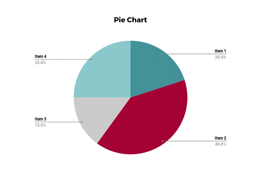 Pie charts are one of the most common and basic data visualization techniques, used across a wide range of applications.
Pie charts are ideal for illustrating proportions, or part-to-whole comparisons.
Because pie charts are relatively simple and easy to read, they’re best suited for audiences who might be unfamiliar with the information or are only interested in the key takeaways.
For viewers who require a more thorough explanation of the data, pie charts fall short in their ability to display complex information.
2. bar chart
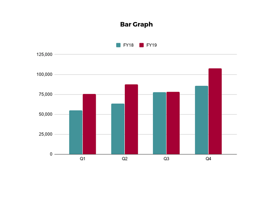 The classic bar chart, or bar graph, is another common and easy-to-use method of data visualization.
In this type of visualization, one axis of the chart shows the categories being compared, and the other, a measured value.
The length of the bar indicates how each group measures according to the value.
One drawback is that labeling and clarity can become problematic when there are too many categories included.
Like pie charts, they can also be too simple for more complex data sets.
3. histogram
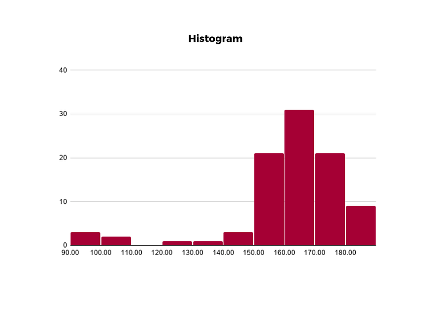 Unlike bar charts, histograms illustrate the distribution of data over a continuous interval or defined period.
These visualizations are helpful in identifying where values are concentrated, as well as where there are gaps or unusual values.
Histograms are especially useful for showing the frequency of a particular occurrence.
For instance, if you’d like to show how many clicks your website received each day over the last week, you can use a histogram.
From this visualization, you can quickly determine which days your website saw the greatest and fewest number of clicks.
4. gantt chart
 Gantt charts are particularly common in project management, as they’re useful in illustrating a project timeline or progression of tasks.
In this type of chart, tasks to be performed are listed on the vertical axis and time intervals on the horizontal axis.
Horizontal bars in the body of the chart represent the duration of each activity.
Utilizing Gantt charts to display timelines can be incredibly helpful, and enable team members to keep track of every aspect of a project.
Even if you’re not a project management professional, familiarizing yourself with Gantt charts can help you stay organized.
5. heat map
6. a box and whisker plot
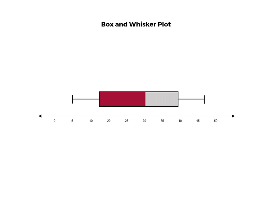 A box and whisker plot, or box plot, provides a visual summary of data through its quartiles.
First, a box is drawn from the first quartile to the third of the data set.
A line within the box represents the median.
“Whiskers,” or lines, are then drawn extending from the box to the minimum (lower extreme) and maximum (upper extreme).
Outliers are represented by individual points that are in-line with the whiskers.
This type of chart is helpful in quickly identifying whether or not the data is symmetrical or skewed, as well as providing a visual summary of the data set that can be easily interpreted.
7. waterfall chart
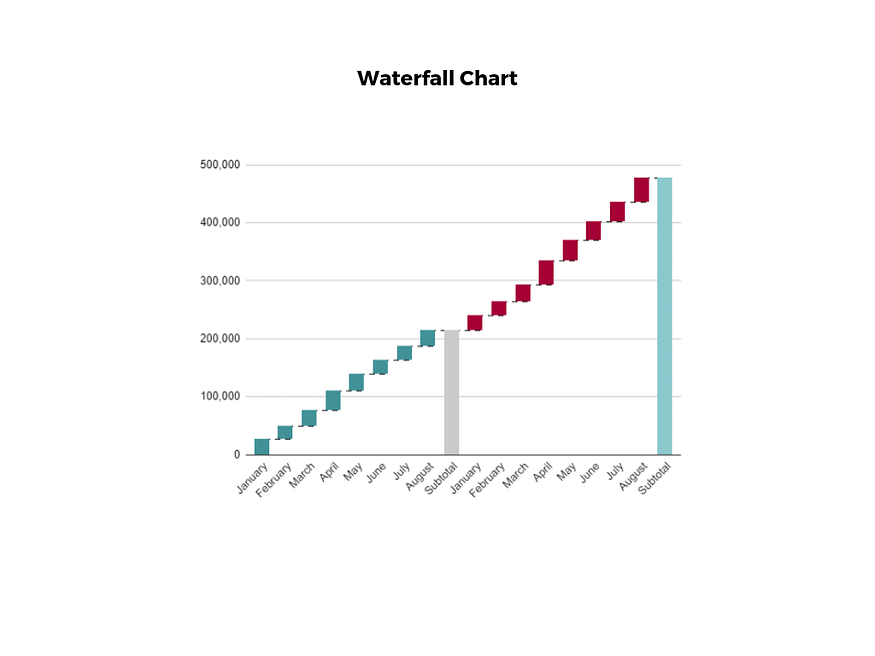 A waterfall chart is a visual representation that illustrates how a value changes as it’s influenced by different factors, such as time.
The main goal of this chart is to show the viewer how a value has grown or declined over a defined period.
For example, waterfall charts are popular for showing spending or earnings over time.
8. area chart
 An area chart, or area graph, is a variation on a basic line graph in which the area underneath the line is shaded to represent the total value of each data point.
When several data series must be compared on the same graph, stacked area charts are used.
This method of data visualization is useful for showing changes in one or more quantities over time, as well as showing how each quantity combines to make up the whole.
Stacked area charts are effective in showing part-to-whole comparisons.
9. scatter plot
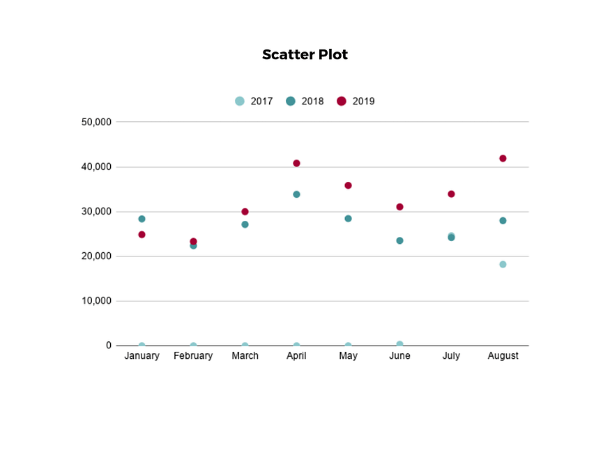 Another technique commonly used to display data is a scatter plot.
A scatter plot displays data for two variables as represented by points plotted against the horizontal and vertical axis.
This type of data visualization is useful in illustrating the relationships that exist between variables and can be used to identify trends or correlations in data.
Scatter plots are most effective for fairly large data sets, since it’s often easier to identify trends when there are more data points present.
Additionally, the closer the data points are grouped together, the stronger the correlation or trend tends to be.
10. pictogram chart
11. timeline
 Timelines are the most effective way to visualize a sequence of events in chronological order.
They’re typically linear, with key events outlined along the axis.
Timelines are used to communicate time-related information and display historical data.
Timelines allow you to highlight the most important events that occurred, or need to occur in the future, and make it easy for the viewer to identify any patterns appearing within the selected time period.
While timelines are often relatively simple linear visualizations, they can be made more visually appealing by adding images, colors, fonts, and decorative shapes.
12. highlight table
 A highlight table is a more engaging alternative to traditional tables.
By highlighting cells in the table with color, you can make it easier for viewers to quickly spot trends and patterns in the data.
These visualizations are useful for comparing categorical data.
Depending on the data visualization tool you’re using, you may be able to add conditional formatting rules to the table that automatically color cells that meet specified conditions.
For instance, when using a highlight table to visualize a company’s sales data, you may color cells red if the sales data is below the goal, or green if sales were above the goal.
Unlike a heat map, the colors in a highlight table are discrete and represent a single meaning or value.
13. bullet graph
 A bullet graph is a variation of a bar graph that can act as an alternative to dashboard gauges to represent performance data.
The main use for a bullet graph is to inform the viewer of how a business is performing in comparison to benchmarks that are in place for key business metrics.
In a bullet graph, the darker horizontal bar in the middle of the chart represents the actual value, while the vertical line represents a comparative value, or target.
If the horizontal bar passes the vertical line, the target for that metric has been surpassed.
Additionally, the segmented colored sections behind the horizontal bar represent range scores, such as “poor,” “fair,” or “good.”
14. choropleth maps
 A choropleth map uses color, shading, and other patterns to visualize numerical values across geographic regions.
These visualizations use a progression of color (or shading) on a spectrum to distinguish high values from low.
Choropleth maps allow viewers to see how a variable changes from one region to the next.
A potential downside to this type of visualization is that the exact numerical values aren’t easily accessible because the colors represent a range of values.
Some data visualization tools, however, allow you to add interactivity to your map so the exact values are accessible.
15. word cloud
 A word cloud, or tag cloud, is a visual representation of text data in which the size of the word is proportional to its frequency.
The more often a specific word appears in a dataset, the larger it appears in the visualization.
In addition to size, words often appear bolder or follow a specific color scheme depending on their frequency.
Word clouds are often used on websites and blogs to identify significant keywords and compare differences in textual data between two sources.
They are also useful when analyzing qualitative datasets, such as the specific words consumers used to describe a product.
16. network diagram
 Network diagrams are a type of data visualization that represent relationships between qualitative data points.
These visualizations are composed of nodes and links, also called edges.
Nodes are singular data points that are connected to other nodes through edges, which show the relationship between multiple nodes.
There are many use cases for network diagrams, including depicting social networks, highlighting the relationships between employees at an organization, or visualizing product sales across geographic regions.
17. correlation matrix
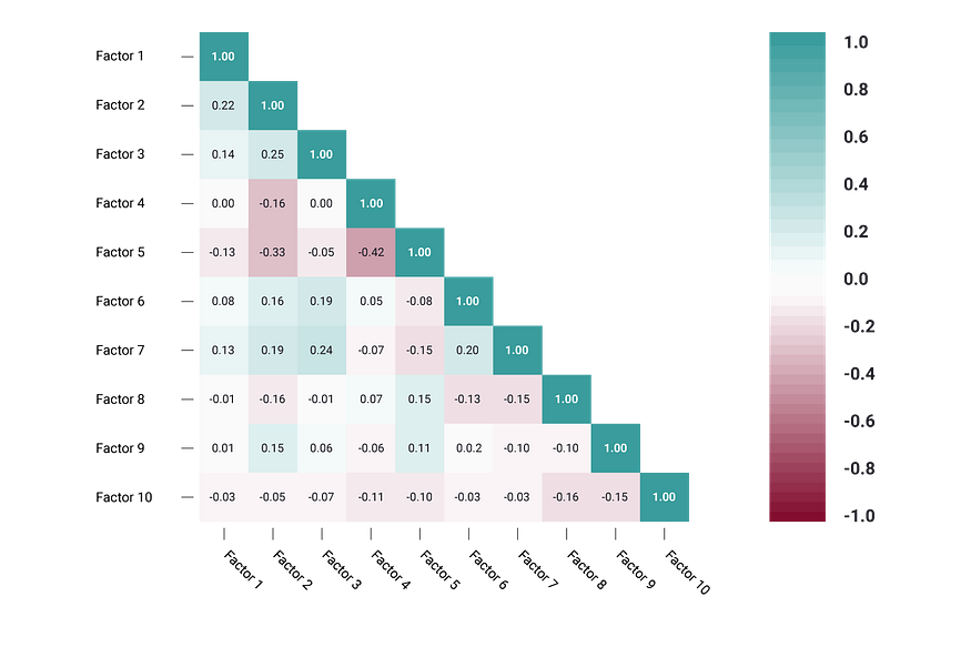 A correlation matrix is a table that shows correlation coefficients between variables.
Each cell represents the relationship between two variables, and a color scale is used to communicate whether the variables are correlated and to what extent.
Correlation matrices are useful to summarize and find patterns in large data sets.
In business, a correlation matrix might be used to analyze how different data points about a specific product might be related, such as price, advertising spend, launch date, etc.
other data visualization options
While the examples listed above are some of the most commonly used techniques, there are many other ways you can visualize data to become a more effective communicator. Some other data visualization options include: Bubble clouds Cartograms Circle views Dendrograms Dot distribution maps Open-high-low-close charts Polar areas Radial trees Ring Charts Sankey diagram Span charts Streamgraphs Treemaps Wedge stack graphs Violin plotstips for creating effective visualizations
Creating effective data visualizations requires more than just knowing how to choose the best technique for your needs. There are several considerations you should take into account to maximize your effectiveness when it comes to presenting data. One of the most important steps is to evaluate your audience. For example, if you’re presenting financial data to a team that works in an unrelated department, you’ll want to choose a fairly simple illustration. On the other hand, if you’re presenting financial data to a team of finance experts, it’s likely you can safely include more complex information. Another helpful tip is to avoid unnecessary distractions. Although visual elements like animation can be a great way to add interest, they can also distract from the key points the illustration is trying to convey and hinder the viewer’s ability to quickly understand the information. Finally, be mindful of the colors you utilize, as well as your overall design. While it’s important that your graphs or charts are visually appealing, there are more practical reasons you might choose one color palette over another. For instance, using low contrast colors can make it difficult for your audience to discern differences between data points. Using colors that are too bold, however, can make the illustration overwhelming or distracting for the viewer.visuals to interpret and share information
No matter your role or title within an organization, data visualization is a skill that’s important for all professionals. Being able to effectively present complex data through easy-to-understand visual representations is invaluable when it comes to communicating information with members both inside and outside your business. There’s no shortage in how data visualization can be applied in the real world. Data is playing an increasingly important role in the marketplace today, and data literacy is the first step in understanding how analytics can be used in business.K-Means Clustering in R Programming
K Means Clustering in R Programming is an Unsupervised Non-linear algorithm that cluster data based on similarity or similar groups. It seeks to partition the observations into a pre-specified number of clusters. Segmentation of data takes place to assign each training example to a segment called a cluster. In the unsupervised algorithm, high reliance on raw data is given with large expenditure on manual review for review of relevance is given. It is used in a variety of fields like Banking, healthcare, retail, Media, etc.Theory
K-Means clustering groups the data on similar groups. The algorithm is as follows: Choose the number K clusters. Select at random K points, the centroids(Not necessarily from the given data). Assign each data point to closest centroid that forms K clusters. Compute and place the new centroid of each centroid. Reassign each data point to new cluster. After final reassignment, name the cluster as Final cluster.The Dataset
Iris dataset consists of 50 samples from each of 3 species of Iris(Iris setosa, Iris virginica, Iris versicolor) and a multivariate dataset introduced by British statistician and biologist Ronald Fisher in his 1936 paper The use of multiple measurements in taxonomic problems. Four features were measured from each sample i.e length and width of the sepals and petals and based on the combination of these four features, Fisher developed a linear discriminant model to distinguish the species from each other.
# Loading data
data(iris)
# Structure
str(iris)
Performing K-Means Clustering on Dataset
Using K-Means Clustering algorithm on the dataset which includes 11 persons and 6 variables or attributes# Installing Packages
install.packages("ClusterR")
install.packages("cluster")
# Loading package
library(ClusterR)
library(cluster)
# Removing initial label of
# Species from original dataset
iris_1 <- iris[, -5]
# Fitting K-Means clustering Model
# to training dataset
set.seed(240) # Setting seed
kmeans.re <- kmeans(iris_1, centers = 3, nstart = 20)
kmeans.re
# Cluster identification for
# each observation
kmeans.re$cluster
# Confusion Matrix
cm <- table(iris$Species, kmeans.re$cluster)
cm
# Model Evaluation and visualization
plot(iris_1[c("Sepal.Length", "Sepal.Width")])
plot(iris_1[c("Sepal.Length", "Sepal.Width")],
col = kmeans.re$cluster)
plot(iris_1[c("Sepal.Length", "Sepal.Width")],
col = kmeans.re$cluster,
main = "K-means with 3 clusters")
## Plotiing cluster centers
kmeans.re$centers
kmeans.re$centers[, c("Sepal.Length", "Sepal.Width")]
# cex is font size, pch is symbol
points(kmeans.re$centers[, c("Sepal.Length", "Sepal.Width")],
col = 1:3, pch = 8, cex = 3)
## Visualizing clusters
y_kmeans <- kmeans.re$cluster
clusplot(iris_1[, c("Sepal.Length", "Sepal.Width")],
y_kmeans,
lines = 0,
shade = TRUE,
color = TRUE,
labels = 2,
plotchar = FALSE,
span = TRUE,
main = paste("Cluster iris"),
xlab = 'Sepal.Length',
ylab = 'Sepal.Width')
Output:
Model kmeans_re:
 The 3 clusters are made which are of 50, 62, and 38 sizes respectively. Within the cluster, the sum of squares is 88.4%.
Cluster identification:
 The model achieved an accuracy of 100% with a p-value of less than 1. This indicates the model is good.
Confusion Matrix:
 So, 50 Setosa are correctly classified as Setosa. Out of 62 Versicolor, 48 Versicolor are correctly classified as Versicolor and 14 are classified as virginica. Out of 36 virginica, 19 virginica are correctly classified as virginica and 2 are classified as Versicolor.
K-means with 3 clusters plot:
 The model showed 3 cluster plots with three different colors and with Sepal.length and with Sepal.width.
Plotting cluster centers:
 In the plot, centers of clusters are marked with cross signs with the same color of the cluster.
Plot of clusters:
 So, 3 clusters are formed with varying sepal length and sepal width. Hence, the K-Means clustering algorithm is widely used in the industry.
K-Means Clustering in R: Step-by-Step Example
Clustering is a technique in machine learning that attempts to find clusters of observations within a dataset. The goal is to find clusters such that the observations within each cluster are quite similar to each other, while observations in different clusters are quite different from each other. Clustering is a form of unsupervised learning because we’re simply attempting to find structure within a dataset rather than predicting the value of some response variable. Clustering is often used in marketing when companies have access to information like: Household income Household size Head of household Occupation Distance from nearest urban area When this information is available, clustering can be used to identify households that are similar and may be more likely to purchase certain products or respond better to a certain type of advertising. One of the most common forms of clustering is known ask-means clustering.What is K-Means Clustering?
K-means clustering is a technique in which we place each observation in a dataset into one of K clusters. The end goal is to haveKclusters in which the observations within each cluster are quite similar to each other while the observations in different clusters are quite different from each other. In practice, we use the following steps to perform K-means clustering: 1. Choose a value forK. First, we must decide how many clusters we’d like to identify in the data. Often we have to simply test several different values for K and analyze the results to see which number of clusters seems to make the most sense for a given problem. 2. Randomly assign each observation to an initial cluster, from 1 toK. 3. Perform the following procedure until the cluster assignments stop changing. For each of theKclusters, compute the clustercentroid. This is simply the vector of the p feature means for the observations in the kth cluster. Assign each observation to the cluster whose centroid is closest. Here,closest is defined using Euclidean distance.K-Means Clustering in R
The following tutorial provides a step-by-step example of how to perform k-means clustering in R.Step 1: Load the Necessary Packages
First, we’ll load two packages that contain several useful functions for k-means clustering in R. library(factoextra) library(cluster)Step 2: Load and Prep the Data
For this example we’lluse the USArrestsdataset built into R, which contains the number of arrests per 100,000 residents in each U.S. state in 1973 for Murder, Assault, and Rape along with the percentage of the population in each state living in urban areas, UrbanPop. The following code shows how to do the following: Load the USArrests dataset Remove any rows with missing values Scale each variable in the dataset to have a mean of 0 and a standard deviation of 1 #load data df <- USArrests #remove rows with missing values df <- na.omit(df) #scale each variable to have a mean of 0 and sd of 1 df <- scale(df) #view first six rows of dataset head(df) Murder Assault UrbanPop Rape Alabama 1.24256408 0.7828393 -0.5209066 -0.003416473 Alaska 0.50786248 1.1068225 -1.2117642 2.484202941 Arizona 0.07163341 1.4788032 0.9989801 1.042878388 Arkansas 0.23234938 0.2308680 -1.0735927 -0.184916602 California 0.27826823 1.2628144 1.7589234 2.067820292 Colorado 0.02571456 0.3988593 0.8608085 1.864967207Step 3: Find the Optimal Number of Clusters
To perform k-means clustering in R we can use the built-in kmeans() function, which uses the following syntax: kmeans(data, centers, nstart) where: data: Name of the dataset. centers: The number of clusters, denoted k. nstart: The number of initial configurations. Because it’s possible that different initial starting clusters can lead to different results, it’s recommended to use several different initial configurations. The k-means algorithm will find the initial configurations that lead to the smallest within-cluster variation. Since we don’t know beforehand how many clusters is optimal, we’ll create two different plots that can help us decide: 1. Number of Clusters vs. the Total Within Sum of Squares First, we’ll use thefviz_nbclust() function to create a plot of the number of clusters vs. the total within sum of squares: fviz_nbclust(df, kmeans, method = "wss") Typically when we create this type of plot we look for an “elbow” where the sum of squares begins to “bend” or level off.
This is typically the optimal number of clusters.
For this plot it appear that there is a bit of an elbow or “bend” at k = 4 clusters.
2. Number of Clusters vs. Gap Statistic
Another way to determine the optimal number of clusters is to use a metric known as the gap statistic, which compares the total intra-cluster variation for different values of k with their expected values for a distribution with no clustering.
We can calculate the gap statistic for each number of clusters using theclusGap() function from thecluster package along with a plot of clusters vs.
gap statistic using the fviz_gap_stat() function:
#calculate gap statistic based on number of clusters
gap_stat <- clusGap(df, FUN = kmeans, nstart = 25, K.max = 10, B = 50)
#plot number of clusters vs. gap statistic
fviz_gap_stat(gap_stat)
 From the plot we can see that gap statistic is highest at k = 4 clusters, which matches the elbow method we used earlier.
Step 4: Perform K-Means Clustering with Optimal K
Lastly, we can perform k-means clustering on the dataset using the optimal value fork of 4: #make this example reproducible set.seed(1) #perform k-means clustering with k = 4 clusters km <- kmeans(df, centers = 4, nstart = 25) #view results km K-means clustering with 4 clusters of sizes 16, 13, 13, 8 Cluster means: Murder Assault UrbanPop Rape 1 -0.4894375 -0.3826001 0.5758298 -0.26165379 2 -0.9615407 -1.1066010 -0.9301069 -0.96676331 3 0.6950701 1.0394414 0.7226370 1.27693964 4 1.4118898 0.8743346 -0.8145211 0.01927104 Clustering vector: Alabama Alaska Arizona Arkansas California Colorado 4 3 3 4 3 3 Connecticut Delaware Florida Georgia Hawaii Idaho 1 1 3 4 1 2 Illinois Indiana Iowa Kansas Kentucky Louisiana 3 1 2 1 2 4 Maine Maryland Massachusetts Michigan Minnesota Mississippi 2 3 1 3 2 4 Missouri Montana Nebraska Nevada New Hampshire New Jersey 3 2 2 3 2 1 New Mexico New York North Carolina North Dakota Ohio Oklahoma 3 3 4 2 1 1 Oregon Pennsylvania Rhode Island South Carolina South Dakota Tennessee 1 1 1 4 2 4 Texas Utah Vermont Virginia Washington West Virginia 3 1 2 1 1 2 Wisconsin Wyoming 2 1 Within cluster sum of squares by cluster: [1] 16.212213 11.952463 19.922437 8.316061 (between_SS / total_SS = 71.2 %) Available components: [1] "cluster" "centers" "totss" "withinss" "tot.withinss" "betweenss" [7] "size" "iter" "ifault" From the results we can see that: 16 states were assigned to the first cluster 13 states were assigned to the second cluster 13 states were assigned to the third cluster 8 states were assigned to the fourth cluster We can visualize the clusters on a scatterplot that displays the first two principal components on the axes using thefivz_cluster() function: #plot results of final k-means model fviz_cluster(km, data = df) We can also use theaggregate() function to find the mean of the variables in each cluster:
#find means of each cluster
aggregate(USArrests, by=list(cluster=km$cluster), mean)
cluster Murder Assault UrbanPop Rape
1 3.60000 78.53846 52.07692 12.17692
2 10.81538 257.38462 76.00000 33.19231
3 5.65625 138.87500 73.87500 18.78125
4 13.93750 243.62500 53.75000 21.41250
We interpret this output is as follows:
The mean number of murders per 100,000 citizens among the states in cluster 1 is 3.6.
The mean number of assaults per 100,000 citizens among the states in cluster 1 is 78.5.
The mean percentage of residents living in an urban area among the states in cluster 1 is 52.1%.
The mean number of rapes per 100,000 citizens among the states in cluster 1 is 12.2.
And so on.
We can also append the cluster assignments of each state back to the original dataset:
#add cluster assigment to original data
final_data <- cbind(USArrests, cluster = km$cluster)
#view final data
head(final_data)
Murder Assault UrbanPop Rape cluster
Alabama 13.2 236 58 21.2 4
Alaska 10.0 263 48 44.5 2
Arizona 8.1 294 80 31.0 2
Arkansas 8.8 190 50 19.5 4
California 9.0 276 91 40.6 2
Colorado 7.9 204 78 38.7 2
Pros & Cons of K-Means Clustering
K-means clustering offers the following benefits: It is a fast algorithm. It can handle large datasets well. However, it comes with the following potential drawbacks: It requires us to specify the number of clusters before performing the algorithm. It’s sensitive to outliers. Two alternatives to k-means clustering are k-medoids clustering and hierarchical clustering. You can find the complete R code used in this example here.Chrome Devtools Protocol
https://github.com/rstudio/chromote Chromote is not the only R package that implements the Chrome Devtools Protocol. Here are some others: crrri by Romain Lesur and Christophe Dervieux decapitated by Bob Rudis chradle by Miles McBain Installation remotes::install_github("rstudio/chromote")50 ggplot2 Visualizations
Part 1: Introduction to ggplot2
1. Understanding the Ggplot Syntax
2. How to Make a Simple Scatterplot
3. Adjusting the X and Y axis limits
Method 1: By deleting the points outside the range
Method 2: Zooming In
4. How to Change the Title and Axis Labels
5. How to Change the Color and Size of Points
How to Change the Color and Size To Static?
How to Change the Color To Reflect Categories in Another Column?
6. How to Change the X Axis Texts and Ticks Location
How to Change the X and Y Axis Text and its Location?
How to Write Customized Texts for Axis Labels, by Formatting the Original Values?
How to Customize the Entire Theme in One Shot using Pre-Built Themes?
Part 2
1. Adding Plot and Axis Titles
2. Modifying Legend
How to Change the Legend Title
How to Change Legend Labels and Point Colors for Categories
Change the Order of Legend
How to Style the Legend Title, Text and Key
How to Remove the Legend and Change Legend Positions
3. Adding Text, Label and Annotation
How to Add Text and Label around the Points
How to Add Annotations Anywhere inside Plot
4. Flipping and Reversing X and Y Axis
How to flip the X and Y axis?
How to reverse the scale of an axis?
5. Faceting: Draw multiple plots within one figure
Facet Wrap
Facet Grid
6. Modifying Plot Background, Major and Minor Axis
How to Change Plot background
How to Remove Major and Minor Grid, Change Border, Axis Title, Text and Ticks
Add an Image in Background
Inheritance Structure of Theme Components
Top 50 ggplot2 Visualizations - The Master List
1. Correlation
Scatterplot
Scatterplot With Encircling
Jitter Plot
Counts Chart
Bubble plot
Animated Bubble chart
Marginal Histogram / Boxplot
Correlogram
2. Deviation
Diverging bars
Diverging Lollipop Chart
Diverging Dot Plot
Area Chart
3. Ranking
Ordered Bar Chart
Lollipop Chart
Dot Plot
Slope Chart
Dumbbell Plot
4. Distribution
Histogram
Density plot
Box Plot
Dot + Box Plot
Tufte Boxplot
Violin Plot
Population Pyramid
5. Composition
Waffle Chart
Pie Chart
Treemap
Bar Chart
6. Change
Time Series Plot From a Time Series Object (
Time Series Plot From a Data Frame
Time Series Plot For a Monthly Time Series
Time Series Plot For a Yearly Time Series
Time Series Plot From Long Data Format: Multiple Time Series in Same Dataframe Column
Time Series Plot From Wide Data Format: Data in Multiple Columns of Dataframe
Stacked Area Chart
Calendar Heatmap
Slope Chart
Seasonal Plot
7. Groups
Hierarchical Dendrogram
Clusters
8. Spatial
Open Street Map
Google Road Map
Google Hybrid Map
Previously we saw a brief tutorial of making charts with ggplot2 package.
It quickly touched upon the various aspects of making ggplot.
Now, this is a complete and full fledged tutorial.
I start from scratch and discuss how to construct and customize almost any ggplot.
It goes into the principles, steps and nuances of making the plots effective and more visually appealing.
So, for practical purposes I hope this tutorial serves well as a bookmark reference that will be useful for your day-to-day plotmaking.
This is part 1 of a three part tutorial on ggplot2, an aesthetically pleasing (and very popular) graphics framework in R.
This tutorial is primarily geared towards those having some basic knowledge of the R programming language and want to make complex and nice looking charts with R ggplot2.
Part 1: Introduction to ggplot2, covers the basic knowledge about constructing simple ggplots and modifying the components and aesthetics.
Part 2: Customizing the Look and Feel, is about more advanced customization like manipulating legend, annotations, multiplots with faceting and custom layouts
Part 3: Top 50 Ggplot2 Visualizations - The Master List, applies what was learnt in part 1 and 2 to construct other types of ggplots such as bar charts, boxplots etc.
1. Understanding the Ggplot Syntax
2. How to Make a Simple Scatterplot
3. Adjusting the X and Y axis limits
Method 1: By deleting the points outside the range
Method 2: Zooming In
4. How to Change the Title and Axis Labels
5. How to Change the Color and Size of Points
How to Change the Color and Size To Static?
How to Change the Color To Reflect Categories in Another Column?
6. How to Change the X Axis Texts and Ticks Location
How to Change the X and Y Axis Text and its Location?
How to Write Customized Texts for Axis Labels, by Formatting the Original Values?
How to Customize the Entire Theme in One Shot using Pre-Built Themes?
Part 2
1. Adding Plot and Axis Titles
2. Modifying Legend
How to Change the Legend Title
How to Change Legend Labels and Point Colors for Categories
Change the Order of Legend
How to Style the Legend Title, Text and Key
How to Remove the Legend and Change Legend Positions
3. Adding Text, Label and Annotation
How to Add Text and Label around the Points
How to Add Annotations Anywhere inside Plot
4. Flipping and Reversing X and Y Axis
How to flip the X and Y axis?
How to reverse the scale of an axis?
5. Faceting: Draw multiple plots within one figure
Facet Wrap
Facet Grid
6. Modifying Plot Background, Major and Minor Axis
How to Change Plot background
How to Remove Major and Minor Grid, Change Border, Axis Title, Text and Ticks
Add an Image in Background
Inheritance Structure of Theme Components
Top 50 ggplot2 Visualizations - The Master List
1. Correlation
Scatterplot
Scatterplot With Encircling
Jitter Plot
Counts Chart
Bubble plot
Animated Bubble chart
Marginal Histogram / Boxplot
Correlogram
2. Deviation
Diverging bars
Diverging Lollipop Chart
Diverging Dot Plot
Area Chart
3. Ranking
Ordered Bar Chart
Lollipop Chart
Dot Plot
Slope Chart
Dumbbell Plot
4. Distribution
Histogram
Density plot
Box Plot
Dot + Box Plot
Tufte Boxplot
Violin Plot
Population Pyramid
5. Composition
Waffle Chart
Pie Chart
Treemap
Bar Chart
6. Change
Time Series Plot From a Time Series Object (
ts)Time Series Plot From a Data Frame
Time Series Plot For a Monthly Time Series
Time Series Plot For a Yearly Time Series
Time Series Plot From Long Data Format: Multiple Time Series in Same Dataframe Column
Time Series Plot From Wide Data Format: Data in Multiple Columns of Dataframe
Stacked Area Chart
Calendar Heatmap
Slope Chart
Seasonal Plot
7. Groups
Hierarchical Dendrogram
Clusters
8. Spatial
Open Street Map
Google Road Map
Google Hybrid Map
Part 1: Introduction to ggplot2
1. Understanding the Ggplot Syntax
The syntax for constructing ggplots could be puzzling if you are a beginner or work primarily with base graphics. The main difference is that, unlike base graphics, ggplot works with dataframes and not individual vectors. All the data needed to make the plot is typically be contained within the dataframe supplied to theggplot() itself or can be supplied to respective geoms.
More on that later.
The second noticeable feature is that you can keep enhancing the plot by adding more layers (and themes) to an existing plot created using the ggplot() function.
Let’s initialize a basic ggplot based on the midwest dataset.
# Setup
options(scipen=999) # turn off scientific notation like 1e+06
library(ggplot2)
data("midwest", package = "ggplot2") # load the data
# midwest <- read.csv("http://goo.gl/G1K41K") # alt source
# Init Ggplot
ggplot(midwest, aes(x=area, y=poptotal)) # area and poptotal are columns in 'midwest'
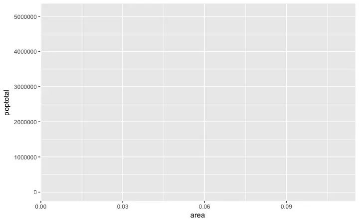 A blank ggplot is drawn.
Even though the
 x and y are specified, there are no points or lines in it.
This is because, ggplot doesn’t assume that you meant a scatterplot or a line chart to be drawn.
I have only told ggplot what dataset to use and what columns should be used for X and Y axis.
I haven’t explicitly asked it to draw any points.
Also note that aes() function is used to specify the X and Y axes.
That’s because, any information that is part of the source dataframe has to be specified inside the aes() function.
2. How to Make a Simple Scatterplot
Let’s make a scatterplot on top of the blank ggplot by adding points using a geom layer calledgeom_point.
library(ggplot2)
ggplot(midwest, aes(x=area, y=poptotal)) + geom_point()
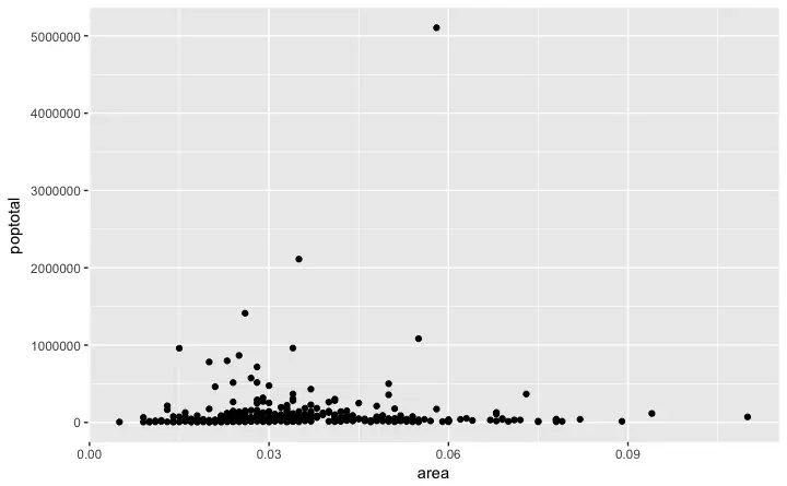 We got a basic scatterplot, where each point represents a county.
However, it lacks some basic components such as the plot title, meaningful axis labels etc.
Moreover most of the points are concentrated on the bottom portion of the plot, which is not so nice.
You will see how to rectify these in upcoming steps.
Like
 geom_point(), there are many such geom layers which we will see in a subsequent part in this tutorial series.
For now, let’s just add a smoothing layer using geom_smooth(method='lm').
Since the method is set as lm (short for linear model), it draws the line of best fit.
library(ggplot2)
g <- ggplot(midwest, aes(x=area, y=poptotal)) + geom_point() + geom_smooth(method="lm") # set se=FALSE to turnoff confidence bands
plot(g)
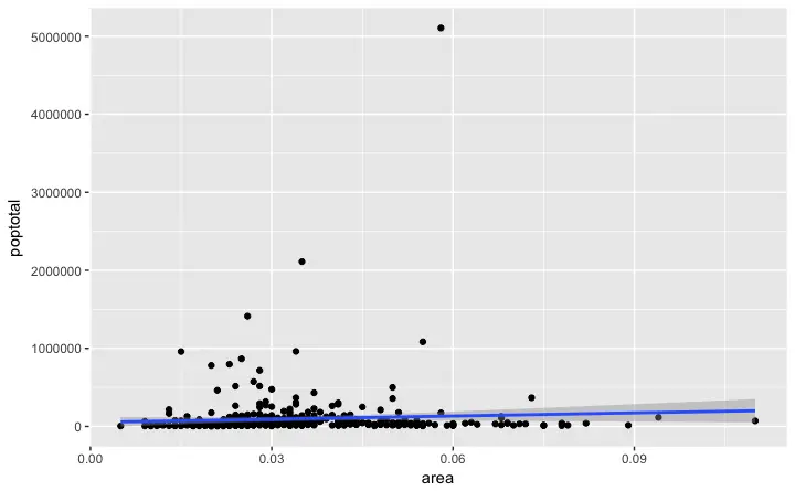 The line of best fit is in blue.
Can you find out what other
 method options are available for geom_smooth? (note: see ?geom_smooth).
You might have noticed that majority of points lie in the bottom of the chart which doesn’t really look nice.
So, let’s change the Y-axis limits to focus on the lower half.
3. Adjusting the X and Y axis limits
The X and Y axis limits can be controlled in 2 ways.Method 1: By deleting the points outside the range
This will change the lines of best fit or smoothing lines as compared to the original data. This can be done byxlim() and ylim().
You can pass a numeric vector of length 2 (with max and min values) or just the max and min values itself.
library(ggplot2)
g <- ggplot(midwest, aes(x=area, y=poptotal)) + geom_point() + geom_smooth(method="lm") # set se=FALSE to turnoff confidence bands
# Delete the points outside the limits
g + xlim(c(0, 0.1)) + ylim(c(0, 1000000)) # deletes points
# g + xlim(0, 0.1) + ylim(0, 1000000) # deletes points
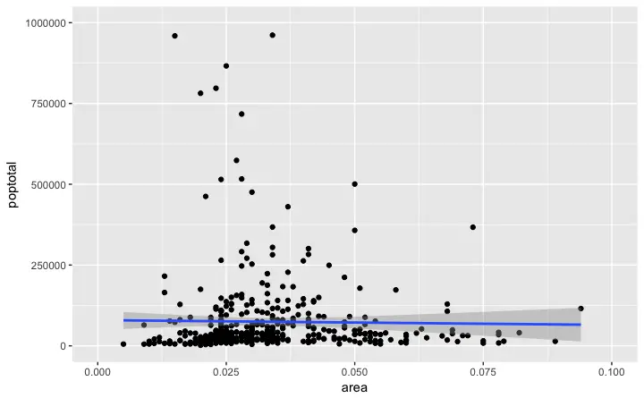 In this case, the chart was not built from scratch but rather was built on top of
 g.
This is because, the previous plot was stored as g, a ggplot object, which when called will reproduce the original plot.
Using ggplot, you can add more layers, themes and other settings on top of this plot.
Did you notice that the line of best fit became more horizontal compared to the original plot? This is because, when using xlim() and ylim(), the points outside the specified range are deleted and will not be considered while drawing the line of best fit (using geom_smooth(method='lm')).
This feature might come in handy when you wish to know how the line of best fit would change when some extreme values (or outliers) are removed.
Method 2: Zooming In
The other method is to change the X and Y axis limits by zooming in to the region of interest without deleting the points. This is done usingcoord_cartesian().
Let’s store this plot as g1.
library(ggplot2)
g <- ggplot(midwest, aes(x=area, y=poptotal)) + geom_point() + geom_smooth(method="lm") # set se=FALSE to turnoff confidence bands
# Zoom in without deleting the points outside the limits.
# As a result, the line of best fit is the same as the original plot.
g1 <- g + coord_cartesian(xlim=c(0,0.1), ylim=c(0, 1000000)) # zooms in
plot(g1)
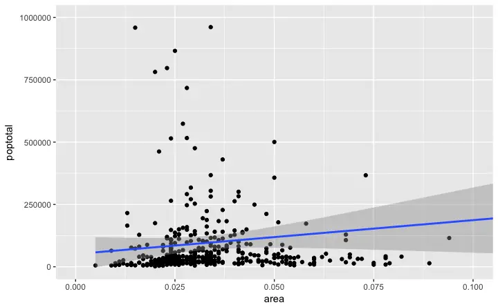 Since all points were considered, the line of best fit did not change.
4. How to Change the Title and Axis Labels
I have stored this asg1.
Let’s add the plot title and labels for X and Y axis.
This can be done in one go using the labs() function with title, x and y arguments.
Another option is to use the ggtitle(), xlab() and ylab().
library(ggplot2)
g <- ggplot(midwest, aes(x=area, y=poptotal)) + geom_point() + geom_smooth(method="lm") # set se=FALSE to turnoff confidence bands
g1 <- g + coord_cartesian(xlim=c(0,0.1), ylim=c(0, 1000000)) # zooms in
# Add Title and Labels
g1 + labs(title="Area Vs Population", subtitle="From midwest dataset", y="Population", x="Area", caption="Midwest Demographics")
# or
g1 + ggtitle("Area Vs Population", subtitle="From midwest dataset") + xlab("Area") + ylab("Population")
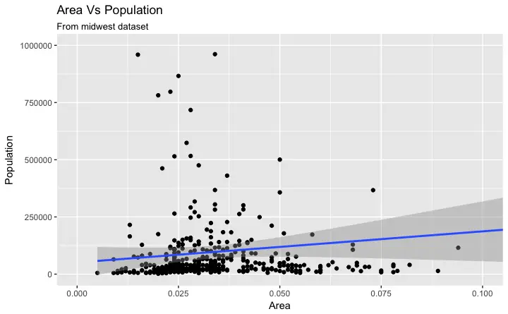 Excellent! So here is the full function call.
# Full Plot call
library(ggplot2)
ggplot(midwest, aes(x=area, y=poptotal)) +
geom_point() +
geom_smooth(method="lm") +
coord_cartesian(xlim=c(0,0.1), ylim=c(0, 1000000)) +
labs(title="Area Vs Population", subtitle="From midwest dataset", y="Population", x="Area", caption="Midwest Demographics")
5. How to Change the Color and Size of Points
How to Change the Color and Size To Static?
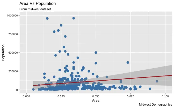
We can change the aesthetics of a geom layer by modifying the respective geoms. Let’s change the color of the points and the line to a static value.library(ggplot2)
ggplot(midwest, aes(x=area, y=poptotal)) +
geom_point(col="steelblue", size=3) + # Set static color and size for points
geom_smooth(method="lm", col="firebrick") + # change the color of line
coord_cartesian(xlim=c(0, 0.1), ylim=c(0, 1000000)) +
labs(title="Area Vs Population", subtitle="From midwest dataset", y="Population", x="Area", caption="Midwest Demographics")
How to Change the Color To Reflect Categories in Another Column?
Suppose if we want the color to change based on another column in the source dataset (midwest), it must be specified inside the aes() function.
library(ggplot2)
gg <- ggplot(midwest, aes(x=area, y=poptotal)) +
geom_point(aes(col=state), size=3) + # Set color to vary based on state categories.
geom_smooth(method="lm", col="firebrick", size=2) +
coord_cartesian(xlim=c(0, 0.1), ylim=c(0, 1000000)) +
labs(title="Area Vs Population", subtitle="From midwest dataset", y="Population", x="Area", caption="Midwest Demographics")
plot(gg)
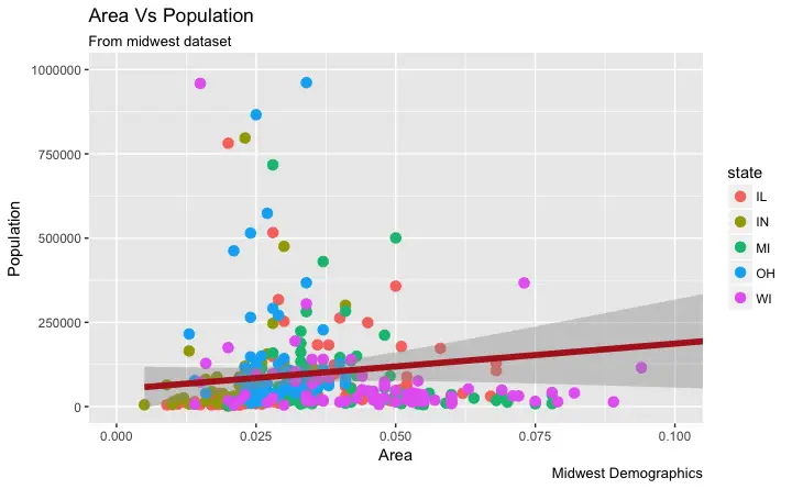 Now each point is colored based on the
 state it belongs because of aes(col=state).
Not just color, but size, shape, stroke (thickness of boundary) and fill (fill color) can be used to discriminate groupings.
As an added benefit, the legend is added automatically.
If needed, it can be removed by setting the legend.position to None from within a theme() function.
gg + theme(legend.position="None") # remove legend
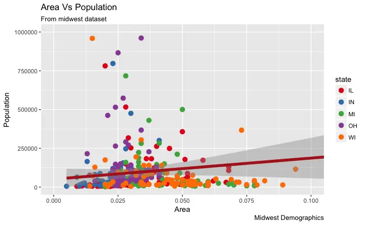
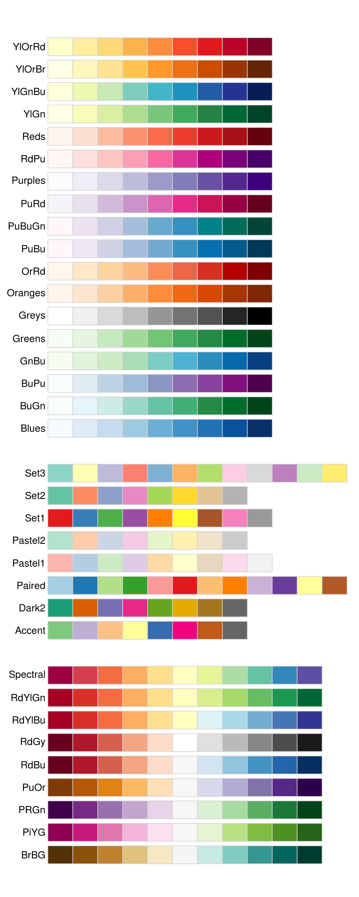
Also, You can change the color palette entirely.
gg + scale_colour_brewer(palette = "Set1") # change color palette
 More of such palettes can be found in the RColorBrewer package
library(RColorBrewer)
head(brewer.pal.info, 10) # show 10 palettes
#> maxcolors category colorblind
#> BrBG 11 div TRUE
#> PiYG 11 div TRUE
#> PRGn 11 div TRUE
#> PuOr 11 div TRUE
#> RdBu 11 div TRUE
#> RdGy 11 div FALSE
#> RdYlBu 11 div TRUE
#> RdYlGn 11 div FALSE
#> Spectral 11 div FALSE
#> Accent 8 qual FALSE
6. How to Change the X Axis Texts and Ticks Location
How to Change the X and Y Axis Text and its Location?
Alright, now let’s see how to change the X and Y axis text and its location. This involves two aspects:breaks and labels.
Step 1: Set the breaks
The breaks should be of the same scale as the X axis variable.
Note that I am using scale_x_continuous because, the X axis variable is a continuous variable.
Had it been a date variable, scale_x_date could be used.
Like scale_x_continuous() an equivalent scale_y_continuous() is available for Y axis.
library(ggplot2)
# Base plot
gg <- ggplot(midwest, aes(x=area, y=poptotal)) +
geom_point(aes(col=state), size=3) + # Set color to vary based on state categories.
geom_smooth(method="lm", col="firebrick", size=2) +
coord_cartesian(xlim=c(0, 0.1), ylim=c(0, 1000000)) +
labs(title="Area Vs Population", subtitle="From midwest dataset", y="Population", x="Area", caption="Midwest Demographics")
# Change breaks
gg + scale_x_continuous(breaks=seq(0, 0.1, 0.01))
 Step 2: Change the
 labels You can optionally change the labels at the axis ticks.
labels take a vector of the same length as breaks.
Let me demonstrate by setting the labels to alphabets from a to k (though there is no meaning to it in this context).
library(ggplots)
# Base Plot
gg <- ggplot(midwest, aes(x=area, y=poptotal)) +
geom_point(aes(col=state), size=3) + # Set color to vary based on state categories.
geom_smooth(method="lm", col="firebrick", size=2) +
coord_cartesian(xlim=c(0, 0.1), ylim=c(0, 1000000)) +
labs(title="Area Vs Population", subtitle="From midwest dataset", y="Population", x="Area", caption="Midwest Demographics")
# Change breaks + label
gg + scale_x_continuous(breaks=seq(0, 0.1, 0.01), labels = letters[1:11])
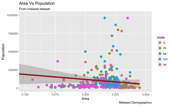
 If you need to reverse the scale, use
 scale_x_reverse().
library(ggplot2)
gg <- ggplot(midwest, aes(x=area, y=poptotal)) +
geom_point(aes(col=state), size=3) + # Set color to vary based on state categories.
geom_smooth(method="lm", col="firebrick", size=2) +
coord_cartesian(xlim=c(0, 0.1), ylim=c(0, 1000000)) +
labs(title="Area Vs Population", subtitle="From midwest dataset", y="Population", x="Area", caption="Midwest Demographics")
# Reverse X Axis Scale
gg + scale_x_reverse()
How to Write Customized Texts for Axis Labels, by Formatting the Original Values?
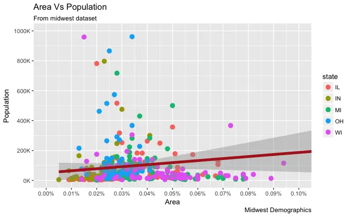
Let’s set thebreaks for Y axis text as well and format the X and Y axis labels.
I have used 2 methods for formatting labels: * Method 1: Using sprintf().
(Have formatted it as % in below example) * Method 2: Using a custom user defined function.
(Formatted 1000’s to 1K scale)
Use whichever method feels convenient.
library(ggplot2)
# Base Plot
gg <- ggplot(midwest, aes(x=area, y=poptotal)) +
geom_point(aes(col=state), size=3) + # Set color to vary based on state categories.
geom_smooth(method="lm", col="firebrick", size=2) +
coord_cartesian(xlim=c(0, 0.1), ylim=c(0, 1000000)) +
labs(title="Area Vs Population", subtitle="From midwest dataset", y="Population", x="Area", caption="Midwest Demographics")
# Change Axis Texts
gg + scale_x_continuous(breaks=seq(0, 0.1, 0.01), labels = sprintf("%1.2f%%", seq(0, 0.1, 0.01))) +
scale_y_continuous(breaks=seq(0, 1000000, 200000), labels = function(x){paste0(x/1000, 'K')})
How to Customize the Entire Theme in One Shot using Pre-Built Themes?
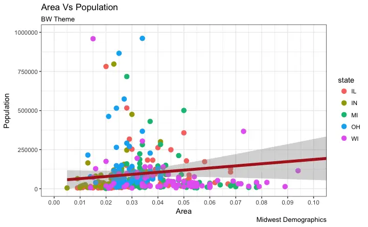
Finally, instead of changing the theme components individually (which I discuss in detail in part 2), we can change the entire theme itself using pre-built themes. The help page?theme_bw shows all the available built-in themes.
This again is commonly done in couple of ways.
* Use the theme_set() to set the theme before drawing the ggplot.
Note that this setting will affect all future plots.
* Draw the ggplot and then add the overall theme setting (eg.
theme_bw())
library(ggplot2)
# Base plot
gg <- ggplot(midwest, aes(x=area, y=poptotal)) +
geom_point(aes(col=state), size=3) + # Set color to vary based on state categories.
geom_smooth(method="lm", col="firebrick", size=2) +
coord_cartesian(xlim=c(0, 0.1), ylim=c(0, 1000000)) +
labs(title="Area Vs Population", subtitle="From midwest dataset", y="Population", x="Area", caption="Midwest Demographics")
gg <- gg + scale_x_continuous(breaks=seq(0, 0.1, 0.01))
# method 1: Using theme_set()
theme_set(theme_classic()) # not run
gg
# method 2: Adding theme Layer itself.
gg + theme_bw() + labs(subtitle="BW Theme")
gg + theme_classic() + labs(subtitle="Classic Theme")
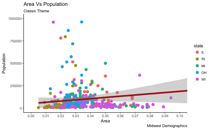 For more customized and fancy themes have a look at the ggthemes package and the ggthemr package.
That’s it for the basics.
We are now ably positioned to tackle more advanced customization.
In ggplot tutorial part-2, I discuss about advanced customization on modifying theme components, manipulating legend, annotations, faceting and custom layouts.
Part 2
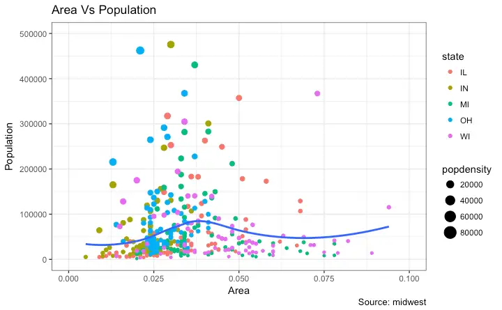
This is part 2 of a 3-part tutorial on ggplot2, an aesthetically pleasing (and very popular) graphics framework in R. This tutorial is primarily geared towards those having some basic knowledge of the R programming language and want to make complex and nice looking charts with R ggplot2. Part 1: Introduction to ggplot2, covers the basic knowledge about constructing simple ggplots and modifying the components and aesthetics. Part 2: Customizing the Look and Feel, is about more advanced customization like manipulating legend, annotations, multiplots with faceting and custom layouts Part 3: Top 50 ggplot2 Visualizations - The Master List, applies what was learnt in part 1 and 2 to construct other types of ggplots such as bar charts, boxplots etc. Part 2: Customizing the look and feel In this tutorial, I discuss how to customize the looks of the 6 most important aesthetics of a plot. Put together, it provides a fairly comprehensive list of how to accomplish your plot customization tasks in detail. Let’s begin with a scatterplot of Population against Area frommidwest dataset.
The point’s color and size vary based on state (categorical) and popdensity (continuous) columns respectively.
We have done something similar in the previous ggplot2 tutorial already.
The below plot has the essential components such as the title, axis labels and legend setup nicely.
But how to modify the looks?
Most of the requirements related to look and feel can be achieved using the theme() function.
It accepts a large number of arguments.
Type ?theme in the R console and see for yourself.
# Setup
options(scipen=999)
library(ggplot2)
data("midwest", package = "ggplot2")
theme_set(theme_bw())
# midwest <- read.csv("http://goo.gl/G1K41K") # bkup data source
# Add plot components --------------------------------
gg <- ggplot(midwest, aes(x=area, y=poptotal)) +
geom_point(aes(col=state, size=popdensity)) +
geom_smooth(method="loess", se=F) + xlim(c(0, 0.1)) + ylim(c(0, 500000)) +
labs(title="Area Vs Population", y="Population", x="Area", caption="Source: midwest")
# Call plot ------------------------------------------
plot(gg)
 The arguments passed to
 theme() components require to be set using special element_type() functions.
They are of 4 major types.
element_text(): Since the title, subtitle and captions are textual items, element_text() function is used to set it.
element_line(): Likewise element_line() is use to modify line based components such as the axis lines, major and minor grid lines, etc.
element_rect(): Modifies rectangle components such as plot and panel background.
element_blank(): Turns off displaying the theme item.
More on this follows in upcoming discussion.
Let’s discuss a number of tasks related to changing the plot output, starting with modifying the title and axis texts.
1. Adding Plot and Axis Titles
Plot and axis titles and the axis text are part of the plot’s theme. Therefore, it can be modified using thetheme() function.
The theme() function accepts one of the four element_type() functions mentioned above as arguments.
Since the plot and axis titles are textual components, element_text() is used to modify them.
Below, I have changed the size, color, face and line-height.
The axis text can be rotated by changing the angle.
library(ggplot2)
# Base Plot
gg <- ggplot(midwest, aes(x=area, y=poptotal)) +
geom_point(aes(col=state, size=popdensity)) +
geom_smooth(method="loess", se=F) + xlim(c(0, 0.1)) + ylim(c(0, 500000)) +
labs(title="Area Vs Population", y="Population", x="Area", caption="Source: midwest")
# Modify theme components -------------------------------------------
gg + theme(plot.title=element_text(size=20,
face="bold",
family="American Typewriter",
color="tomato",
hjust=0.5,
lineheight=1.2), # title
plot.subtitle=element_text(size=15,
family="American Typewriter",
face="bold",
hjust=0.5), # subtitle
plot.caption=element_text(size=15), # caption
axis.title.x=element_text(vjust=10,
size=15), # X axis title
axis.title.y=element_text(size=15), # Y axis title
axis.text.x=element_text(size=10,
angle = 30,
vjust=.5), # X axis text
axis.text.y=element_text(size=10)) # Y axis text
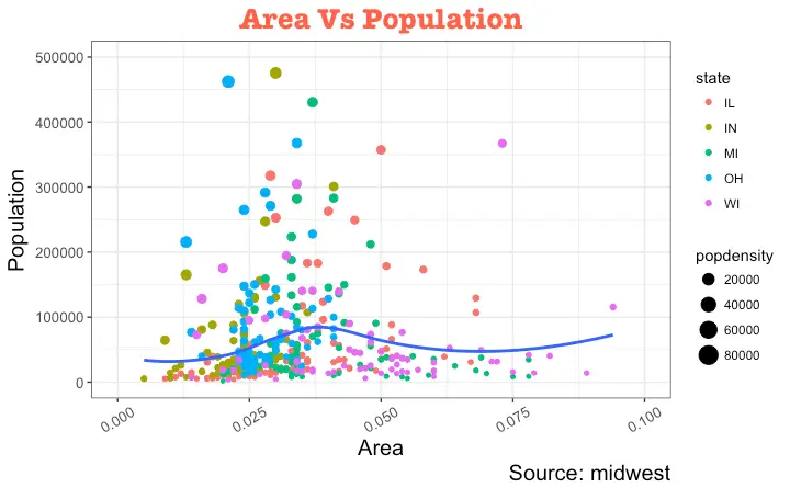
vjust, controls the vertical spacing between title (or label) and plot.
hjust, controls the horizontal spacing.
Setting it to 0.5 centers the title.
family, is used to set a new font
face, sets the font face (“plain”, “italic”, “bold”, “bold.italic”)
Above example covers some of the frequently used theme modifications and the actual list is too long.
So ?theme is the first place you want to look at if you want to change the look and feel of any component.
2. Modifying Legend
Whenever your plot’s geom (like points, lines, bars, etc) is set to change the aesthetics (fill, size, col, shape or stroke) based on another column, as in geom_point(aes(col=state, size=popdensity)), a legend is automatically drawn.
If you are creating a geom where the aesthetics are static, a legend is not drawn by default.
The below examples are for cases where you have the legend created automatically.
How to Change the Legend Title
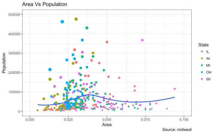
Let’s now change the legend title. We have two legends, one each for color and size. The size is based on a continuous variable while the color is based on a categorical(discrete) variable. There are 3 ways to change the legend title.Method 1: Using labs()
library(ggplot2)
# Base Plot
gg <- ggplot(midwest, aes(x=area, y=poptotal)) +
geom_point(aes(col=state, size=popdensity)) +
geom_smooth(method="loess", se=F) + xlim(c(0, 0.1)) + ylim(c(0, 500000)) +
labs(title="Area Vs Population", y="Population", x="Area", caption="Source: midwest")
gg + labs(color="State", size="Density") # modify legend title
Method 2: Using guides()
library(ggplot2)
# Base Plot
gg <- ggplot(midwest, aes(x=area, y=poptotal)) +
geom_point(aes(col=state, size=popdensity)) +
geom_smooth(method="loess", se=F) + xlim(c(0, 0.1)) + ylim(c(0, 500000)) +
labs(title="Area Vs Population", y="Population", x="Area", caption="Source: midwest")
gg <- gg + guides(color=guide_legend("State"), size=guide_legend("Density")) # modify legend title
plot(gg)
Method 3: Using scale_aesthetic_vartype() format
The format of scale_aestheic_vartype() allows you to turn off legend for one particular aesthetic, leaving the rest in place.
This can be done just by setting guide=FALSE.
For example, if the legend is for size of points based on a continuous variable, then scale_size_continuous() would be the right function to use.
Can you guess what function to use if you have a legend for shape and is based on a categorical variable?
library(ggplot2)
# Base Plot
gg <- ggplot(midwest, aes(x=area, y=poptotal)) +
geom_point(aes(col=state, size=popdensity)) +
geom_smooth(method="loess", se=F) + xlim(c(0, 0.1)) + ylim(c(0, 500000)) +
labs(title="Area Vs Population", y="Population", x="Area", caption="Source: midwest")
# Modify Legend
gg + scale_color_discrete(name="State") + scale_size_continuous(name = "Density", guide = FALSE) # turn off legend for size
How to Change Legend Labels and Point Colors for Categories
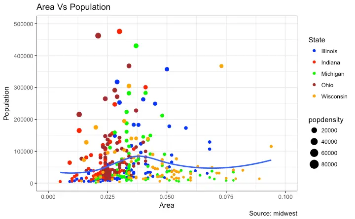
This can be done using the respectivescale_aesthetic_manual() function.
The new legend labels are supplied as a character vector to the labels argument.
If you want to change the color of the categories, it can be assigned to the values argument as shown in below example.
library(ggplot2)
# Base Plot
gg <- ggplot(midwest, aes(x=area, y=poptotal)) +
geom_point(aes(col=state, size=popdensity)) +
geom_smooth(method="loess", se=F) + xlim(c(0, 0.1)) + ylim(c(0, 500000)) +
labs(title="Area Vs Population", y="Population", x="Area", caption="Source: midwest")
gg + scale_color_manual(name="State",
labels = c("Illinois",
"Indiana",
"Michigan",
"Ohio",
"Wisconsin"),
values = c("IL"="blue",
"IN"="red",
"MI"="green",
"OH"="brown",
"WI"="orange"))
Change the Order of Legend
In case you want to show the legend for color (State) before size (Density), it can be done with the guides() function.
The order of the legend has to be set as desired.
If you want to change the position of the labels inside the legend, set it in the required order as seen in previous example.
library(ggplot2)
# Base Plot
gg <- ggplot(midwest, aes(x=area, y=poptotal)) +
geom_point(aes(col=state, size=popdensity)) +
geom_smooth(method="loess", se=F) + xlim(c(0, 0.1)) + ylim(c(0, 500000)) +
labs(title="Area Vs Population", y="Population", x="Area", caption="Source: midwest")
gg + guides(colour = guide_legend(order = 1),
size = guide_legend(order = 2))

How to Style the Legend Title, Text and Key
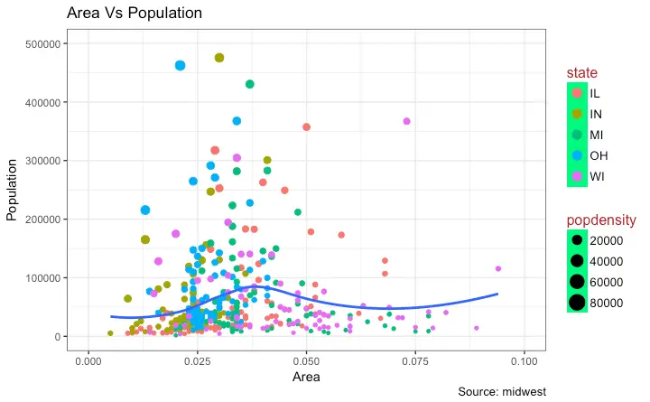
The styling of legend title, text, key and the guide can also be adjusted. The legend’s key is a figure like element, so it has to be set usingelement_rect() function.
library(ggplot2)
# Base Plot
gg <- ggplot(midwest, aes(x=area, y=poptotal)) +
geom_point(aes(col=state, size=popdensity)) +
geom_smooth(method="loess", se=F) + xlim(c(0, 0.1)) + ylim(c(0, 500000)) +
labs(title="Area Vs Population", y="Population", x="Area", caption="Source: midwest")
gg + theme(legend.title = element_text(size=12, color = "firebrick"),
legend.text = element_text(size=10),
legend.key=element_rect(fill='springgreen')) +
guides(colour = guide_legend(override.aes = list(size=2, stroke=1.5)))
How to Remove the Legend and Change Legend Positions
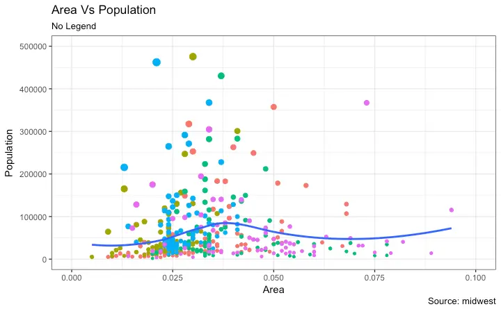
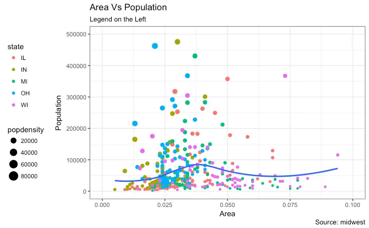
The legend’s position inside the plot is an aspect of the theme. So it can be modified using thetheme() function.
If you want to place the legend inside the plot, you can additionally control the hinge point of the legend using legend.justification.
The legend.position is the x and y axis position in chart area, where (0,0) is bottom left of the chart and (1,1) is top right.
Likewise, legend.justification refers to the hinge point inside the legend.
library(ggplot2)
# Base Plot
gg <- ggplot(midwest, aes(x=area, y=poptotal)) +
geom_point(aes(col=state, size=popdensity)) +
geom_smooth(method="loess", se=F) + xlim(c(0, 0.1)) + ylim(c(0, 500000)) +
labs(title="Area Vs Population", y="Population", x="Area", caption="Source: midwest")
# No legend --------------------------------------------------
gg + theme(legend.position="None") + labs(subtitle="No Legend")
# Legend to the left -----------------------------------------
gg + theme(legend.position="left") + labs(subtitle="Legend on the Left")
# legend at the bottom and horizontal ------------------------
gg + theme(legend.position="bottom", legend.box = "horizontal") + labs(subtitle="Legend at Bottom")
# legend at bottom-right, inside the plot --------------------
gg + theme(legend.title = element_text(size=12, color = "salmon", face="bold"),
legend.justification=c(1,0),
legend.position=c(0.95, 0.05),
legend.background = element_blank(),
legend.key = element_blank()) +
labs(subtitle="Legend: Bottom-Right Inside the Plot")
# legend at top-left, inside the plot -------------------------
gg + theme(legend.title = element_text(size=12, color = "salmon", face="bold"),
legend.justification=c(0,1),
legend.position=c(0.05, 0.95),
legend.background = element_blank(),
legend.key = element_blank()) +
labs(subtitle="Legend: Top-Left Inside the Plot")
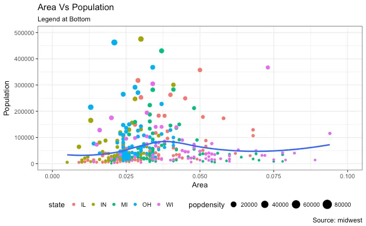
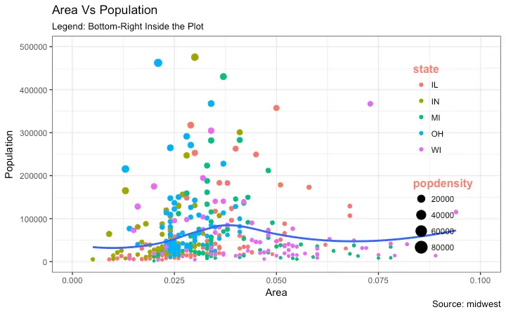
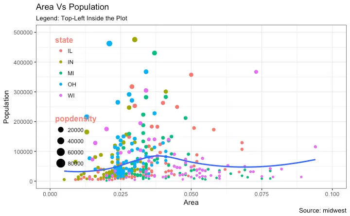
3. Adding Text, Label and Annotation
How to Add Text and Label around the Points
Let’s try adding some text. We will add text to only those counties that have population greater than 400K. In order to achieve this, I create another subsetted dataframe (midwest_sub) that contains only the counties that qualifies the said condition.
Then, draw the geom_text and geom_label with this new dataframe as the data source.
This will ensure that labels (geom_label) are added only for the points contained in the new dataframe.
library(ggplot2)
# Filter required rows.
midwest_sub <- midwest[midwest$poptotal > 300000, ]
midwest_sub$large_county <- ifelse(midwest_sub$poptotal > 300000, midwest_sub$county, ")
# Base Plot
gg <- ggplot(midwest, aes(x=area, y=poptotal)) +
geom_point(aes(col=state, size=popdensity)) +
geom_smooth(method="loess", se=F) + xlim(c(0, 0.1)) + ylim(c(0, 500000)) +
labs(title="Area Vs Population", y="Population", x="Area", caption="Source: midwest")
# Plot text and label ------------------------------------------------------
gg + geom_text(aes(label=large_county), size=2, data=midwest_sub) + labs(subtitle="With ggplot2::geom_text") + theme(legend.position = "None") # text
gg + geom_label(aes(label=large_county), size=2, data=midwest_sub, alpha=0.25) + labs(subtitle="With ggplot2::geom_label") + theme(legend.position = "None") # label
# Plot text and label that REPELS eachother (using ggrepel pkg) ------------
library(ggrepel)
gg + geom_text_repel(aes(label=large_county), size=2, data=midwest_sub) + labs(subtitle="With ggrepel::geom_text_repel") + theme(legend.position = "None") # text
gg + geom_label_repel(aes(label=large_county), size=2, data=midwest_sub) + labs(subtitle="With ggrepel::geom_label_repel") + theme(legend.position = "None") # label
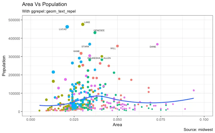
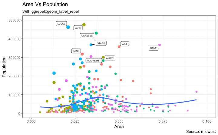 Since the label is looked up from a different dataframe, we need to set the data argument.
How to Add Annotations Anywhere inside Plot
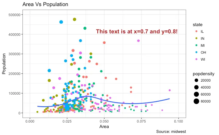
Let’s see how to add annotation to any specific point of the chart. It can be done with theannotation_custom() function which takes in a grob as the argument.
So, let’s create a grob the holds the text you want to display using the grid package.
library(ggplot2)
# Base Plot
gg <- ggplot(midwest, aes(x=area, y=poptotal)) +
geom_point(aes(col=state, size=popdensity)) +
geom_smooth(method="loess", se=F) + xlim(c(0, 0.1)) + ylim(c(0, 500000)) +
labs(title="Area Vs Population", y="Population", x="Area", caption="Source: midwest")
# Define and add annotation -------------------------------------
library(grid)
my_text <- "This text is at x=0.7 and y=0.8!"
my_grob = grid.text(my_text, x=0.7, y=0.8, gp=gpar(col="firebrick", fontsize=14, fontface="bold"))
gg + annotation_custom(my_grob)
4. Flipping and Reversing X and Y Axis
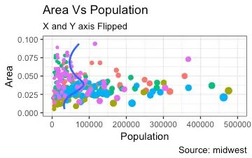
How to flip the X and Y axis?
Just addcoord_flip().
library(ggplot2)
# Base Plot
gg <- ggplot(midwest, aes(x=area, y=poptotal)) +
geom_point(aes(col=state, size=popdensity)) +
geom_smooth(method="loess", se=F) + xlim(c(0, 0.1)) + ylim(c(0, 500000)) +
labs(title="Area Vs Population", y="Population", x="Area", caption="Source: midwest", subtitle="X and Y axis Flipped") + theme(legend.position = "None")
# Flip the X and Y axis -------------------------------------------------
gg + coord_flip()
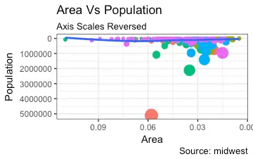
How to reverse the scale of an axis?
This is quite simple. Usescale_x_reverse() for X axis and scale_y_reverse() for Y axis.
library(ggplot2)
# Base Plot
gg <- ggplot(midwest, aes(x=area, y=poptotal)) +
geom_point(aes(col=state, size=popdensity)) +
geom_smooth(method="loess", se=F) + xlim(c(0, 0.1)) + ylim(c(0, 500000)) +
labs(title="Area Vs Population", y="Population", x="Area", caption="Source: midwest", subtitle="Axis Scales Reversed") + theme(legend.position = "None")
# Reverse the X and Y Axis ---------------------------
gg + scale_x_reverse() + scale_y_reverse()
5. Faceting: Draw multiple plots within one figure
Let’s use a thempg dataset for this one.
It is available in the ggplot2 package, or you can import it from this link.
library(ggplot2)
data(mpg, package="ggplot2") # load data
# mpg <- read.csv("http://goo.gl/uEeRGu") # alt data source
g <- ggplot(mpg, aes(x=displ, y=hwy)) +
geom_point() +
labs(title="hwy vs displ", caption = "Source: mpg") +
geom_smooth(method="lm", se=FALSE) +
theme_bw() # apply bw theme
plot(g)
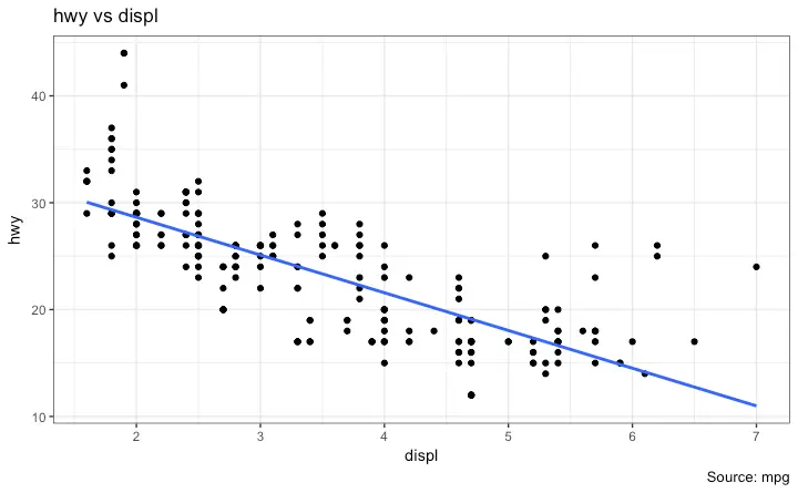 We have a simple chart of highway mileage
 (hwy) against the engine displacement (displ) for the whole dataset.
But what if you want to study how this relationship varies for different classes of vehicles?
Facet Wrap
Thefacet_wrap() is used to break down a large plot into multiple small plots for individual categories.
It takes a formula as the main argument.
The items to the left of ~ forms the rows while those to the right form the columns.
By default, all the plots share the same scale in both X and Y axis.
You can set them free by setting scales='free' but this way it could be harder to compare between groups.
library(ggplot2)
# Base Plot
g <- ggplot(mpg, aes(x=displ, y=hwy)) +
geom_point() +
geom_smooth(method="lm", se=FALSE) +
theme_bw() # apply bw theme
# Facet wrap with common scales
g + facet_wrap( ~ class, nrow=3) + labs(title="hwy vs displ", caption = "Source: mpg", subtitle="Ggplot2 - Faceting - Multiple plots in one figure") # Shared scales
# Facet wrap with free scales
g + facet_wrap( ~ class, scales = "free") + labs(title="hwy vs displ", caption = "Source: mpg", subtitle="Ggplot2 - Faceting - Multiple plots in one figure with free scales") # Scales free
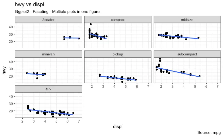
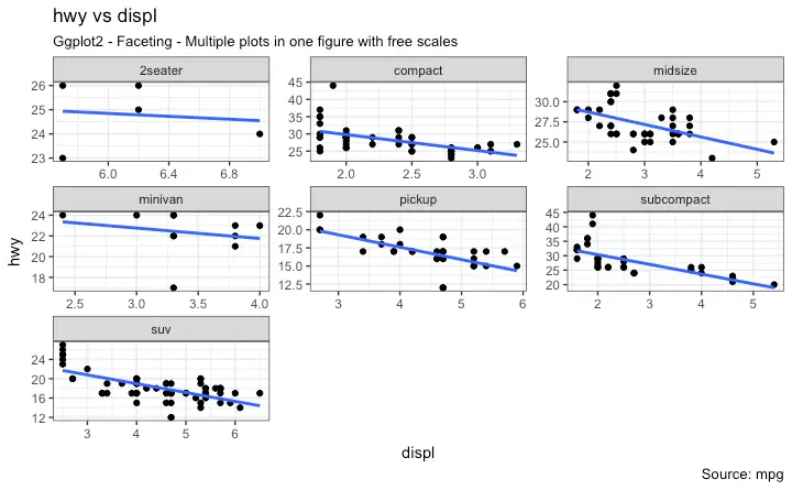 So, What do you infer from this? For one, most 2 seater cars have higher engine displacement while the minivan and compact vehicles are on the lower side.
This is evident from where the points are placed along the X-axis.
Also, the highway mileage drops across all segments as the engine displacement increases.
This drop seems more pronounced in compact and subcompact vehicles.
Facet Grid
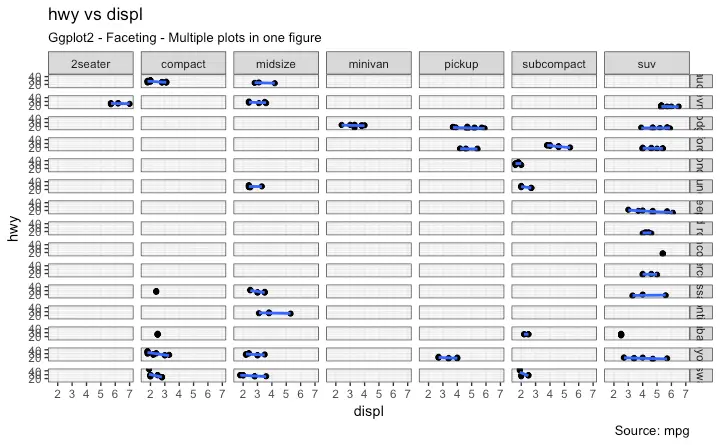
The headings of the middle and bottom rows take up significant space. Thefacet_grid() would get rid of it and give more area to the charts.
The main difference with facet_grid is that it is not possible to choose the number of rows and columns in the grid.
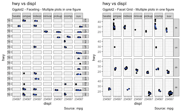
Alright, Let’s create a grid to see how it varies with manufacturer.
library(ggplot2)
# Base Plot
g <- ggplot(mpg, aes(x=displ, y=hwy)) +
geom_point() +
labs(title="hwy vs displ", caption = "Source: mpg", subtitle="Ggplot2 - Faceting - Multiple plots in one figure") +
geom_smooth(method="lm", se=FALSE) +
theme_bw() # apply bw theme
# Add Facet Grid
g1 <- g + facet_grid(manufacturer ~ class) # manufacturer in rows and class in columns
plot(g1)
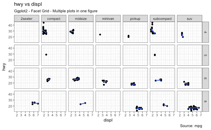
 Let’s make one more to vary by cylinder.
library(ggplot2)
# Base Plot
g <- ggplot(mpg, aes(x=displ, y=hwy)) +
geom_point() +
geom_smooth(method="lm", se=FALSE) +
labs(title="hwy vs displ", caption = "Source: mpg", subtitle="Ggplot2 - Facet Grid - Multiple plots in one figure") +
theme_bw() # apply bw theme
# Add Facet Grid
g2 <- g + facet_grid(cyl ~ class) # cyl in rows and class in columns.
plot(g2)
 Great!.
It is possible to layout both these charts in the sample panel.
I prefer the
 gridExtra() package for this.
# Draw Multiple plots in same figure.
library(gridExtra)
gridExtra::grid.arrange(g1, g2, ncol=2)
6. Modifying Plot Background, Major and Minor Axis
How to Change Plot background
library(ggplot2)
# Base Plot
g <- ggplot(mpg, aes(x=displ, y=hwy)) +
geom_point() +
geom_smooth(method="lm", se=FALSE) +
theme_bw() # apply bw theme
# Change Plot Background elements -----------------------------------
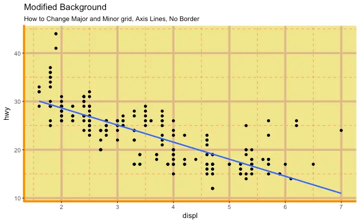
g + theme(panel.background = element_rect(fill = 'khaki'),
panel.grid.major = element_line(colour = "burlywood", size=1.5),
panel.grid.minor = element_line(colour = "tomato",
size=.25,
linetype = "dashed"),
panel.border = element_blank(),
axis.line.x = element_line(colour = "darkorange",
size=1.5,
lineend = "butt"),
axis.line.y = element_line(colour = "darkorange",
size=1.5)) +
labs(title="Modified Background",
subtitle="How to Change Major and Minor grid, Axis Lines, No Border")
# Change Plot Margins -----------------------------------------------
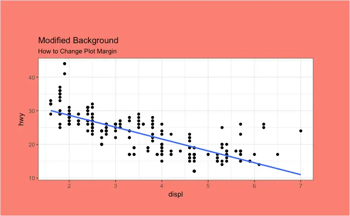
g + theme(plot.background=element_rect(fill="salmon"),
plot.margin = unit(c(2, 2, 1, 1), "cm")) + # top, right, bottom, left
labs(title="Modified Background", subtitle="How to Change Plot Margin")
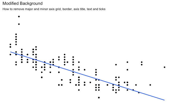
How to Remove Major and Minor Grid, Change Border, Axis Title, Text and Ticks
library(ggplot2)
# Base Plot
g <- ggplot(mpg, aes(x=displ, y=hwy)) +
geom_point() +
geom_smooth(method="lm", se=FALSE) +
theme_bw() # apply bw theme
g + theme(panel.grid.major = element_blank(),
panel.grid.minor = element_blank(),
panel.border = element_blank(),
axis.title = element_blank(),
axis.text = element_blank(),
axis.ticks = element_blank()) +
labs(title="Modified Background", subtitle="How to remove major and minor axis grid, border, axis title, text and ticks")
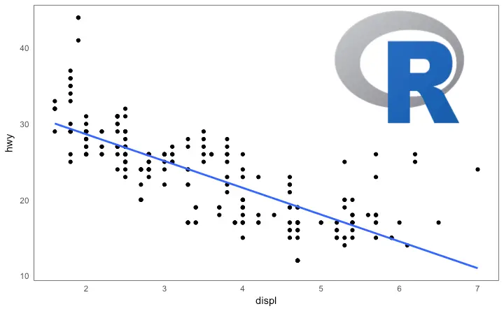
Add an Image in Background
library(ggplot2)
library(grid)
library(png)
img <- png::readPNG("screenshots/Rlogo.png") # source: https://www.r-project.org/
g_pic <- rasterGrob(img, interpolate=TRUE)
# Base Plot
g <- ggplot(mpg, aes(x=displ, y=hwy)) +
geom_point() +
geom_smooth(method="lm", se=FALSE) +
theme_bw() # apply bw theme
g + theme(panel.grid.major = element_blank(),
panel.grid.minor = element_blank(),
plot.title = element_text(size = rel(1.5), face = "bold"),
axis.ticks = element_blank()) +
annotation_custom(g_pic, xmin=5, xmax=7, ymin=30, ymax=45)
Inheritance Structure of Theme Components
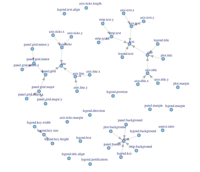 source: http://docs.ggplot2.org/dev/vignettes/themes.html
What type of visualization to use for what sort of problem? This tutorial helps you choose the right type of chart for your specific objectives and how to implement it in R using ggplot2.
This is part 3 of a three part tutorial on ggplot2, an aesthetically pleasing (and very popular) graphics framework in R.
This tutorial is primarily geared towards those having some basic knowledge of the R programming language and want to make complex and nice looking charts with R ggplot2.
Part 1: Introduction to ggplot2, covers the basic knowledge about constructing simple ggplots and modifying the components and aesthetics.
Part 2: Customizing the Look and Feel, is about more advanced customization like manipulating legend, annotations, multiplots with faceting and custom layouts
Part 3: Top 50 ggplot2 Visualizations - The Master List, applies what was learnt in part 1 and 2 to construct other types of ggplots such as bar charts, boxplots etc.
Top 50 ggplot2 Visualizations - The Master List
An effective chart is one that: Conveys the right information without distorting facts. Is simple but elegant. It should not force you to think much in order to get it. Aesthetics supports information rather that overshadow it. Is not overloaded with information. The list below sorts the visualizations based on its primary purpose. Primarily, there are 8 types of objectives you may construct plots. So, before you actually make the plot, try and figure what findings and relationships you would like to convey or examine through the visualization. Chances are it will fall under one (or sometimes more) of these 8 categories.1. Correlation
The following plots help to examine how well correlated two variables are.Scatterplot
The most frequently used plot for data analysis is undoubtedly the scatterplot. Whenever you want to understand the nature of relationship between two variables, invariably the first choice is the scatterplot. It can be drawn usinggeom_point().
Additionally, geom_smooth which draws a smoothing line (based on loess) by default, can be tweaked to draw the line of best fit by setting method='lm'.
# install.packages("ggplot2")
# load package and data
options(scipen=999) # turn-off scientific notation like 1e+48
library(ggplot2)
theme_set(theme_bw()) # pre-set the bw theme.
data("midwest", package = "ggplot2")
# midwest <- read.csv("http://goo.gl/G1K41K") # bkup data source
# Scatterplot
gg <- ggplot(midwest, aes(x=area, y=poptotal)) +
geom_point(aes(col=state, size=popdensity)) +
geom_smooth(method="loess", se=F) +
xlim(c(0, 0.1)) +
ylim(c(0, 500000)) +
labs(subtitle="Area Vs Population",
y="Population",
x="Area",
title="Scatterplot",
caption = "Source: midwest")
plot(gg)
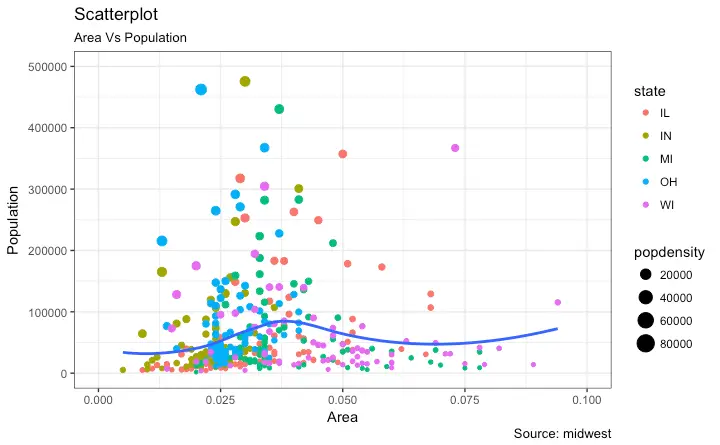
Scatterplot With Encircling
When presenting the results, sometimes I would encirlce certain special group of points or region in the chart so as to draw the attention to those peculiar cases. This can be conveniently done using thegeom_encircle() in ggalt package.
Within geom_encircle(), set the data to a new dataframe that contains only the points (rows) or interest.
Moreover, You can expand the curve so as to pass just outside the points.
The color and size (thickness) of the curve can be modified as well.
See below example.
# install 'ggalt' pkg
# devtools::install_github("hrbrmstr/ggalt")
options(scipen = 999)
library(ggplot2)
library(ggalt)
midwest_select <- midwest[midwest$poptotal > 350000 &
midwest$poptotal <= 500000 &
midwest$area > 0.01 &
midwest$area < 0.1, ]
# Plot
ggplot(midwest, aes(x=area, y=poptotal)) +
geom_point(aes(col=state, size=popdensity)) + # draw points
geom_smooth(method="loess", se=F) +
xlim(c(0, 0.1)) +
ylim(c(0, 500000)) + # draw smoothing line
geom_encircle(aes(x=area, y=poptotal),
data=midwest_select,
color="red",
size=2,
expand=0.08) + # encircle
labs(subtitle="Area Vs Population",
y="Population",
x="Area",
title="Scatterplot + Encircle",
caption="Source: midwest")
Jitter Plot
Let’s look at a new data to draw the scatterplot. This time, I will use thempg dataset to plot city mileage (cty) vs highway mileage (hwy).
# load package and data
library(ggplot2)
data(mpg, package="ggplot2") # alternate source: "http://goo.gl/uEeRGu")
theme_set(theme_bw()) # pre-set the bw theme.
g <- ggplot(mpg, aes(cty, hwy))
# Scatterplot
g + geom_point() +
geom_smooth(method="lm", se=F) +
labs(subtitle="mpg: city vs highway mileage",
y="hwy",
x="cty",
title="Scatterplot with overlapping points",
caption="Source: midwest")
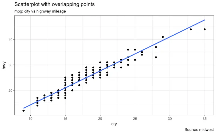 What we have here is a scatterplot of city and highway mileage in
 mpg dataset.
We have seen a similar scatterplot and this looks neat and gives a clear idea of how the city mileage (cty) and highway mileage (hwy) are well correlated.
But, this innocent looking plot is hiding something.
Can you find out?
dim(mpg)
The original data has 234 data points but the chart seems to display fewer points.
What has happened? This is because there are many overlapping points appearing as a single dot.
The fact that both cty and hwy are integers in the source dataset made it all the more convenient to hide this detail.
So just be extra careful the next time you make scatterplot with integers.
So how to handle this? There are few options.
We can make a jitter plot with jitter_geom().
As the name suggests, the overlapping points are randomly jittered around its original position based on a threshold controlled by the width argument.
# load package and data
library(ggplot2)
data(mpg, package="ggplot2")
# mpg <- read.csv("http://goo.gl/uEeRGu")
# Scatterplot
theme_set(theme_bw()) # pre-set the bw theme.
g <- ggplot(mpg, aes(cty, hwy))
g + geom_jitter(width = .5, size=1) +
labs(subtitle="mpg: city vs highway mileage",
y="hwy",
x="cty",
title="Jittered Points")
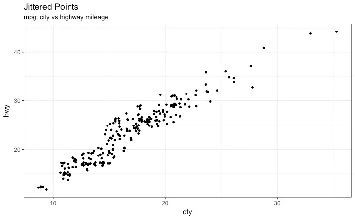 More points are revealed now.
More the
 width, more the points are moved jittered from their original position.
Counts Chart
The second option to overcome the problem of data points overlap is to use what is called a counts chart. Whereever there is more points overlap, the size of the circle gets bigger.# load package and data
library(ggplot2)
data(mpg, package="ggplot2")
# mpg <- read.csv("http://goo.gl/uEeRGu")
# Scatterplot
theme_set(theme_bw()) # pre-set the bw theme.
g <- ggplot(mpg, aes(cty, hwy))
g + geom_count(col="tomato3", show.legend=F) +
labs(subtitle="mpg: city vs highway mileage",
y="hwy",
x="cty",
title="Counts Plot")
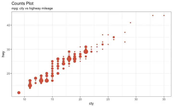
Bubble plot
While scatterplot lets you compare the relationship between 2 continuous variables, bubble chart serves well if you want to understand relationship within the underlying groups based on: A Categorical variable (by changing the color) and Another continuous variable (by changing the size of points). In simpler words, bubble charts are more suitable if you have 4-Dimensional data where two of them are numeric (X and Y) and one other categorical (color) and another numeric variable (size). The bubble chart clearly distinguishes the range ofdispl between the manufacturers and how the slope of lines-of-best-fit varies, providing a better visual comparison between the groups.
# load package and data
library(ggplot2)
data(mpg, package="ggplot2")
# mpg <- read.csv("http://goo.gl/uEeRGu")
mpg_select <- mpg[mpg$manufacturer %in% c("audi", "ford", "honda", "hyundai"), ]
# Scatterplot
theme_set(theme_bw()) # pre-set the bw theme.
g <- ggplot(mpg_select, aes(displ, cty)) +
labs(subtitle="mpg: Displacement vs City Mileage",
title="Bubble chart")
g + geom_jitter(aes(col=manufacturer, size=hwy)) +
geom_smooth(aes(col=manufacturer), method="lm", se=F)
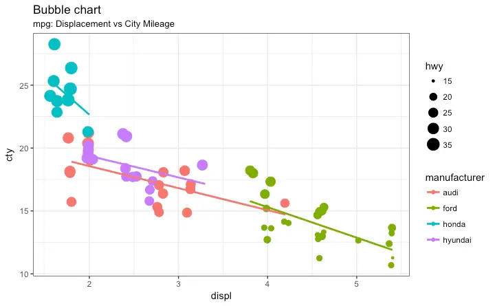
Animated Bubble chart
An animated bubble chart can be implemented using thegganimate package.
It is same as the bubble chart, but, you have to show how the values change over a fifth dimension (typically time).
The key thing to do is to set the aes(frame) to the desired column on which you want to animate.
Rest of the procedure related to plot construction is the same.
Once the plot is constructed, you can animate it using gganimate() by setting a chosen interval.
# Source: https://github.com/dgrtwo/gganimate
# install.packages("cowplot") # a gganimate dependency
# devtools::install_github("dgrtwo/gganimate")
library(ggplot2)
library(gganimate)
library(gapminder)
theme_set(theme_bw()) # pre-set the bw theme.
g <- ggplot(gapminder, aes(gdpPercap, lifeExp, size = pop, frame = year)) +
geom_point() +
geom_smooth(aes(group = year),
method = "lm",
show.legend = FALSE) +
facet_wrap(~continent, scales = "free") +
scale_x_log10() # convert to log scale
gganimate(g, interval=0.2)
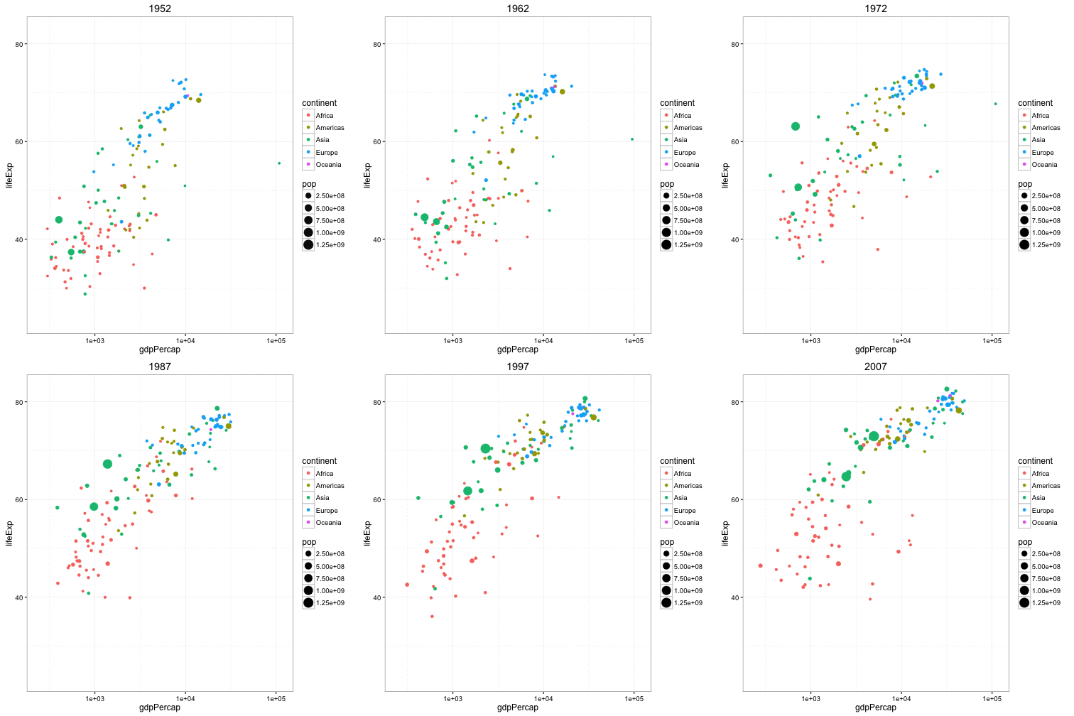
Marginal Histogram / Boxplot
If you want to show the relationship as well as the distribution in the same chart, use the marginal histogram. It has a histogram of the X and Y variables at the margins of the scatterplot. This can be implemented using theggMarginal() function from the ‘ggExtra’ package.
Apart from a histogram, you could choose to draw a marginal boxplot or density plot by setting the respective type option.
# load package and data
library(ggplot2)
library(ggExtra)
data(mpg, package="ggplot2")
# mpg <- read.csv("http://goo.gl/uEeRGu")
# Scatterplot
theme_set(theme_bw()) # pre-set the bw theme.
mpg_select <- mpg[mpg$hwy >= 35 & mpg$cty > 27, ]
g <- ggplot(mpg, aes(cty, hwy)) +
geom_count() +
geom_smooth(method="lm", se=F)
ggMarginal(g, type = "histogram", fill="transparent")
ggMarginal(g, type = "boxplot", fill="transparent")
# ggMarginal(g, type = "density", fill="transparent")
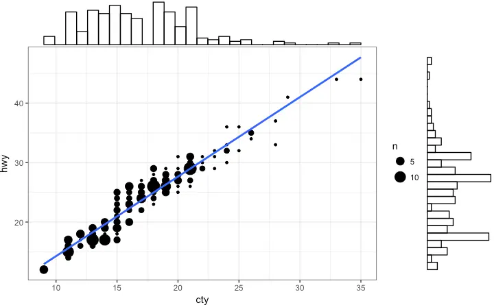
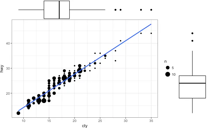
Correlogram
Correlogram let’s you examine the corellation of multiple continuous variables present in the same dataframe. This is conveniently implemented using theggcorrplot package.
# devtools::install_github("kassambara/ggcorrplot")
library(ggplot2)
library(ggcorrplot)
# Correlation matrix
data(mtcars)
corr <- round(cor(mtcars), 1)
# Plot
ggcorrplot(corr, hc.order = TRUE,
type = "lower",
lab = TRUE,
lab_size = 3,
method="circle",
colors = c("tomato2", "white", "springgreen3"),
title="Correlogram of mtcars",
ggtheme=theme_bw)
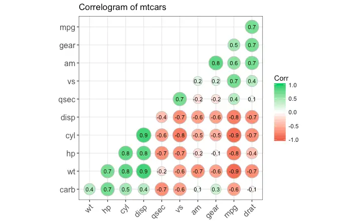
2. Deviation
Compare variation in values between small number of items (or categories) with respect to a fixed reference.Diverging bars
Diverging Bars is a bar chart that can handle both negative and positive values. This can be implemented by a smart tweak withgeom_bar().
But the usage of geom_bar() can be quite confusing.
Thats because, it can be used to make a bar chart as well as a histogram.
Let me explain.
By default, geom_bar() has the stat set to count.
That means, when you provide just a continuous X variable (and no Y variable), it tries to make a histogram out of the data.
In order to make a bar chart create bars instead of histogram, you need to do two things.
Set stat=identity
Provide both x and y inside aes() where, x is either character or factor and y is numeric.
In order to make sure you get diverging bars instead of just bars, make sure, your categorical variable has 2 categories that changes values at a certain threshold of the continuous variable.
In below example, the mpg from mtcars dataset is normalised by computing the z score.
Those vehicles with mpg above zero are marked green and those below are marked red.
library(ggplot2)
theme_set(theme_bw())
# Data Prep
data("mtcars") # load data
mtcars$`car name` <- rownames(mtcars) # create new column for car names
mtcars$mpg_z <- round((mtcars$mpg - mean(mtcars$mpg))/sd(mtcars$mpg), 2) # compute normalized mpg
mtcars$mpg_type <- ifelse(mtcars$mpg_z < 0, "below", "above") # above / below avg flag
mtcars <- mtcars[order(mtcars$mpg_z), ] # sort
mtcars$`car name` <- factor(mtcars$`car name`, levels = mtcars$`car name`) # convert to factor to retain sorted order in plot.
# Diverging Barcharts
ggplot(mtcars, aes(x=`car name`, y=mpg_z, label=mpg_z)) +
geom_bar(stat='identity', aes(fill=mpg_type), width=.5) +
scale_fill_manual(name="Mileage",
labels = c("Above Average", "Below Average"),
values = c("above"="#00ba38", "below"="#f8766d")) +
labs(subtitle="Normalised mileage from 'mtcars'",
title= "Diverging Bars") +
coord_flip()
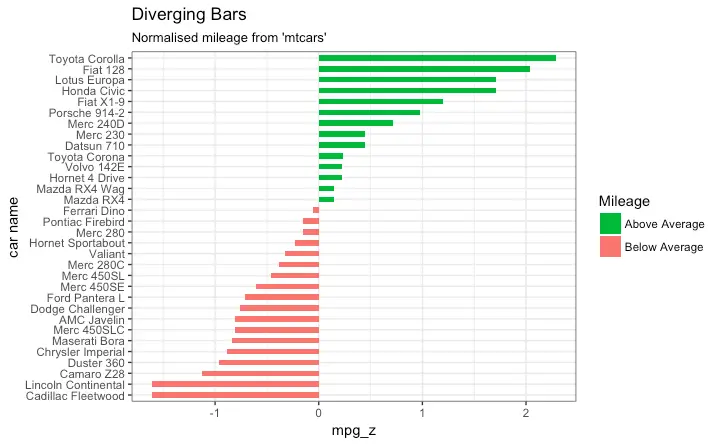
Diverging Lollipop Chart
Lollipop chart conveys the same information as bar chart and diverging bar. Except that it looks more modern. Instead of geom_bar, I usegeom_point and geom_segment to get the lollipops right.
Let’s draw a lollipop using the same data I prepared in the previous example of diverging bars.
library(ggplot2)
theme_set(theme_bw())
ggplot(mtcars, aes(x=`car name`, y=mpg_z, label=mpg_z)) +
geom_point(stat='identity', fill="black", size=6) +
geom_segment(aes(y = 0,
x = `car name`,
yend = mpg_z,
xend = `car name`),
color = "black") +
geom_text(color="white", size=2) +
labs(title="Diverging Lollipop Chart",
subtitle="Normalized mileage from 'mtcars': Lollipop") +
ylim(-2.5, 2.5) +
coord_flip()
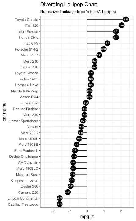
Diverging Dot Plot
Dot plot conveys similar information. The principles are same as what we saw in Diverging bars, except that only point are used.library(ggplot2)
theme_set(theme_bw())
# Plot
ggplot(mtcars, aes(x=`car name`, y=mpg_z, label=mpg_z)) +
geom_point(stat='identity', aes(col=mpg_type), size=6) +
scale_color_manual(name="Mileage",
labels = c("Above Average", "Below Average"),
values = c("above"="#00ba38", "below"="#f8766d")) +
geom_text(color="white", size=2) +
labs(title="Diverging Dot Plot",
subtitle="Normalized mileage from 'mtcars': Dotplot") +
ylim(-2.5, 2.5) +
coord_flip()
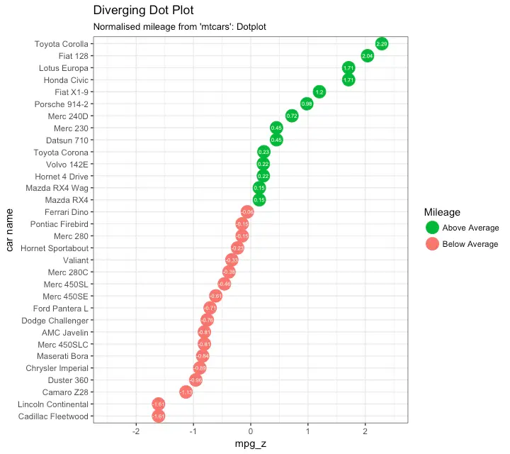
Area Chart
Area charts are typically used to visualize how a particular metric (such as % returns from a stock) performed compared to a certain baseline. Other types of %returns or %change data are also commonly used. Thegeom_area() implements this.
library(ggplot2)
library(quantmod)
data("economics", package = "ggplot2")
# Compute % Returns
economics$returns_perc <- c(0, diff(economics$psavert)/economics$psavert[-length(economics$psavert)])
# Create break points and labels for axis ticks
brks <- economics$date[seq(1, length(economics$date), 12)]
lbls <- lubridate::year(economics$date[seq(1, length(economics$date), 12)])
# Plot
ggplot(economics[1:100, ], aes(date, returns_perc)) +
geom_area() +
scale_x_date(breaks=brks, labels=lbls) +
theme(axis.text.x = element_text(angle=90)) +
labs(title="Area Chart",
subtitle = "Perc Returns for Personal Savings",
y="% Returns for Personal savings",
caption="Source: economics")
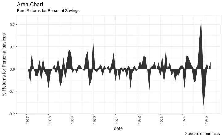
3. Ranking
Used to compare the position or performance of multiple items with respect to each other. Actual values matters somewhat less than the ranking.Ordered Bar Chart
Ordered Bar Chart is a Bar Chart that is ordered by the Y axis variable. Just sorting the dataframe by the variable of interest isn’t enough to order the bar chart. In order for the bar chart to retain the order of the rows, the X axis variable (i.e. the categories) has to be converted into a factor. Let’s plot the mean city mileage for each manufacturer frommpg dataset.
First, aggregate the data and sort it before you draw the plot.
Finally, the X variable is converted to a factor.
Let’s see how that is done.
# Prepare data: group mean city mileage by manufacturer.
cty_mpg <- aggregate(mpg$cty, by=list(mpg$manufacturer), FUN=mean) # aggregate
colnames(cty_mpg) <- c("make", "mileage") # change column names
cty_mpg <- cty_mpg[order(cty_mpg$mileage), ] # sort
cty_mpg$make <- factor(cty_mpg$make, levels = cty_mpg$make) # to retain the order in plot.
head(cty_mpg, 4)
#> make mileage
#> 9 lincoln 11.33333
#> 8 land rover 11.50000
#> 3 dodge 13.13514
#> 10 mercury 13.25000
The X variable is now a factor, let’s plot.
library(ggplot2)
theme_set(theme_bw())
# Draw plot
ggplot(cty_mpg, aes(x=make, y=mileage)) +
geom_bar(stat="identity", width=.5, fill="tomato3") +
labs(title="Ordered Bar Chart",
subtitle="Make Vs Avg.
Mileage",
caption="source: mpg") +
theme(axis.text.x = element_text(angle=65, vjust=0.6))
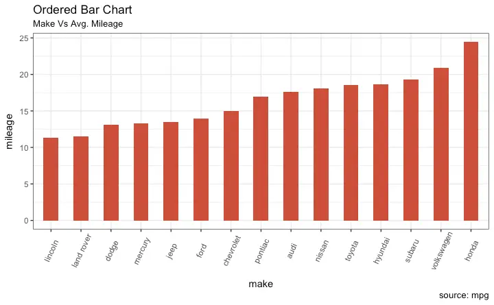
Lollipop Chart
Lollipop charts conveys the same information as in bar charts. By reducing the thick bars into thin lines, it reduces the clutter and lays more emphasis on the value. It looks nice and modern.library(ggplot2)
theme_set(theme_bw())
# Plot
ggplot(cty_mpg, aes(x=make, y=mileage)) +
geom_point(size=3) +
geom_segment(aes(x=make,
xend=make,
y=0,
yend=mileage)) +
labs(title="Lollipop Chart",
subtitle="Make Vs Avg.
Mileage",
caption="source: mpg") +
theme(axis.text.x = element_text(angle=65, vjust=0.6))
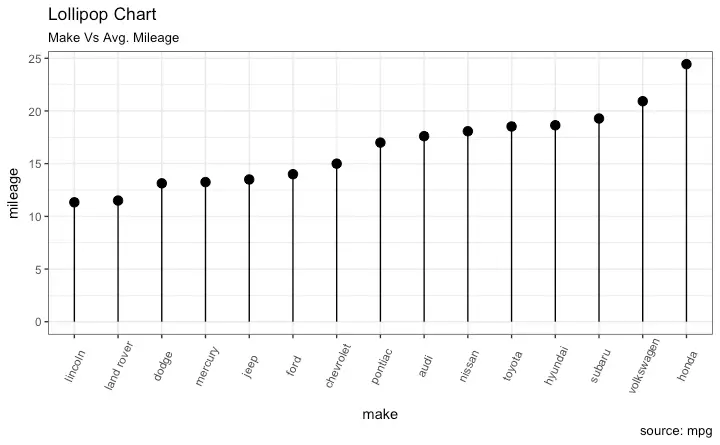
Dot Plot
Dot plots are very similar to lollipops, but without the line and is flipped to horizontal position. It emphasizes more on the rank ordering of items with respect to actual values and how far apart are the entities with respect to each other.library(ggplot2)
library(scales)
theme_set(theme_classic())
# Plot
ggplot(cty_mpg, aes(x=make, y=mileage)) +
geom_point(col="tomato2", size=3) + # Draw points
geom_segment(aes(x=make,
xend=make,
y=min(mileage),
yend=max(mileage)),
linetype="dashed",
size=0.1) + # Draw dashed lines
labs(title="Dot Plot",
subtitle="Make Vs Avg.
Mileage",
caption="source: mpg") +
coord_flip()
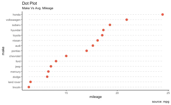
Slope Chart
Slope charts are an excellent way of comparing the positional placements between 2 points on time. At the moment, there is no builtin function to construct this. Following code serves as a pointer about how you may approach this.library(ggplot2)
library(scales)
theme_set(theme_classic())
# prep data
df <- read.csv("https://raw.githubusercontent.com/selva86/datasets/master/gdppercap.csv")
colnames(df) <- c("continent", "1952", "1957")
left_label <- paste(df$continent, round(df$`1952`),sep=", ")
right_label <- paste(df$continent, round(df$`1957`),sep=", ")
df$class <- ifelse((df$`1957` - df$`1952`) < 0, "red", "green")
# Plot
p <- ggplot(df) + geom_segment(aes(x=1, xend=2, y=`1952`, yend=`1957`, col=class), size=.75, show.legend=F) +
geom_vline(xintercept=1, linetype="dashed", size=.1) +
geom_vline(xintercept=2, linetype="dashed", size=.1) +
scale_color_manual(labels = c("Up", "Down"),
values = c("green"="#00ba38", "red"="#f8766d")) + # color of lines
labs(x=", y="Mean GdpPerCap") + # Axis labels
xlim(.5, 2.5) + ylim(0,(1.1*(max(df$`1952`, df$`1957`)))) # X and Y axis limits
# Add texts
p <- p + geom_text(label=left_label, y=df$`1952`, x=rep(1, NROW(df)), hjust=1.1, size=3.5)
p <- p + geom_text(label=right_label, y=df$`1957`, x=rep(2, NROW(df)), hjust=-0.1, size=3.5)
p <- p + geom_text(label="Time 1", x=1, y=1.1*(max(df$`1952`, df$`1957`)), hjust=1.2, size=5) # title
p <- p + geom_text(label="Time 2", x=2, y=1.1*(max(df$`1952`, df$`1957`)), hjust=-0.1, size=5) # title
# Minify theme
p + theme(panel.background = element_blank(),
panel.grid = element_blank(),
axis.ticks = element_blank(),
axis.text.x = element_blank(),
panel.border = element_blank(),
plot.margin = unit(c(1,2,1,2), "cm"))
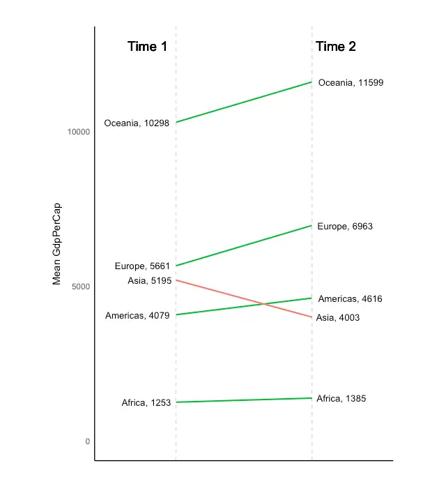
Dumbbell Plot
Dumbbell charts are a great tool if you wish to: 1. Visualize relative positions (like growth and decline) between two points in time. 2. Compare distance between two categories. In order to get the correct ordering of the dumbbells, the Y variable should be a factor and the levels of the factor variable should be in the same order as it should appear in the plot.# devtools::install_github("hrbrmstr/ggalt")
library(ggplot2)
library(ggalt)
theme_set(theme_classic())
health <- read.csv("https://raw.githubusercontent.com/selva86/datasets/master/health.csv")
health$Area <- factor(health$Area, levels=as.character(health$Area)) # for right ordering of the dumbells
# health$Area <- factor(health$Area)
gg <- ggplot(health, aes(x=pct_2013, xend=pct_2014, y=Area, group=Area)) +
geom_dumbbell(color="#a3c4dc",
size=0.75,
point.colour.l="#0e668b") +
scale_x_continuous(label=percent) +
labs(x=NULL,
y=NULL,
title="Dumbbell Chart",
subtitle="Pct Change: 2013 vs 2014",
caption="Source: https://github.com/hrbrmstr/ggalt") +
theme(plot.title = element_text(hjust=0.5, face="bold"),
plot.background=element_rect(fill="#f7f7f7"),
panel.background=element_rect(fill="#f7f7f7"),
panel.grid.minor=element_blank(),
panel.grid.major.y=element_blank(),
panel.grid.major.x=element_line(),
axis.ticks=element_blank(),
legend.position="top",
panel.border=element_blank())
plot(gg)
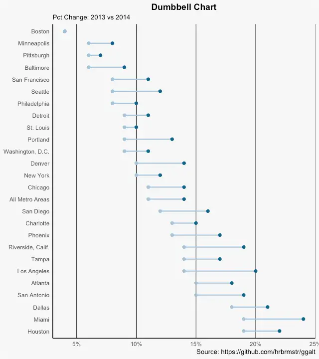
4. Distribution
When you have lots and lots of data points and want to study where and how the data points are distributed.Histogram
By default, if only one variable is supplied, thegeom_bar() tries to calculate the count.
In order for it to behave like a bar chart, the stat=identity option has to be set and x and y values must be provided.
Histogram on a continuous variable
Histogram on a continuous variable can be accomplished using eithergeom_bar() or geom_histogram().
When using geom_histogram(), you can control the number of bars using the bins option.
Else, you can set the range covered by each bin using binwidth.
The value of binwidth is on the same scale as the continuous variable on which histogram is built.
Since, geom_histogram gives facility to control both number of bins as well as binwidth, it is the preferred option to create histogram on continuous variables.
library(ggplot2)
theme_set(theme_classic())
# Histogram on a Continuous (Numeric) Variable
g <- ggplot(mpg, aes(displ)) + scale_fill_brewer(palette = "Spectral")
g + geom_histogram(aes(fill=class),
binwidth = .1,
col="black",
size=.1) + # change binwidth
labs(title="Histogram with Auto Binning",
subtitle="Engine Displacement across Vehicle Classes")
g + geom_histogram(aes(fill=class),
bins=5,
col="black",
size=.1) + # change number of bins
labs(title="Histogram with Fixed Bins",
subtitle="Engine Displacement across Vehicle Classes")
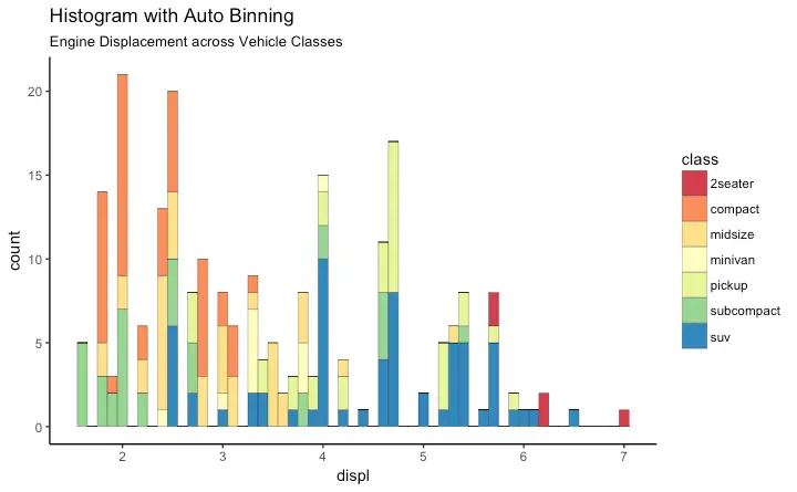
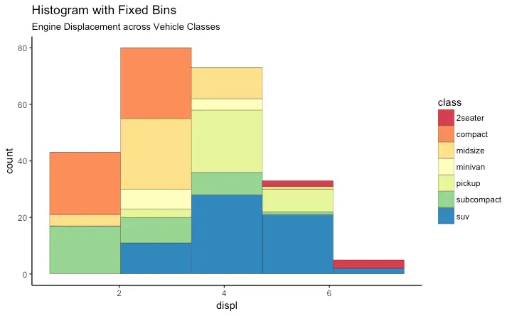
Histogram on a categorical variable
Histogram on a categorical variable would result in a frequency chart showing bars for each category. By adjustingwidth, you can adjust the thickness of the bars.
library(ggplot2)
theme_set(theme_classic())
# Histogram on a Categorical variable
g <- ggplot(mpg, aes(manufacturer))
g + geom_bar(aes(fill=class), width = 0.5) +
theme(axis.text.x = element_text(angle=65, vjust=0.6)) +
labs(title="Histogram on Categorical Variable",
subtitle="Manufacturer across Vehicle Classes")
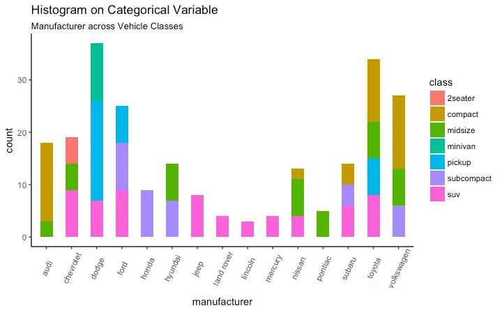
Density plot
library(ggplot2)
theme_set(theme_classic())
# Plot
g <- ggplot(mpg, aes(cty))
g + geom_density(aes(fill=factor(cyl)), alpha=0.8) +
labs(title="Density plot",
subtitle="City Mileage Grouped by Number of cylinders",
caption="Source: mpg",
x="City Mileage",
fill="# Cylinders")
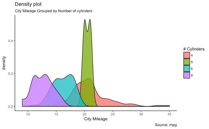
Box Plot
Box plot is an excellent tool to study the distribution. It can also show the distributions within multiple groups, along with the median, range and outliers if any. The dark line inside the box represents the median. The top of box is 75%ile and bottom of box is 25%ile. The end points of the lines (aka whiskers) is at a distance of 1.5*IQR, where IQR or Inter Quartile Range is the distance between 25th and 75th percentiles. The points outside the whiskers are marked as dots and are normally considered as extreme points. Settingvarwidth=T adjusts the width of the boxes to be proportional to the number of observation it contains.
library(ggplot2)
theme_set(theme_classic())
# Plot
g <- ggplot(mpg, aes(class, cty))
g + geom_boxplot(varwidth=T, fill="plum") +
labs(title="Box plot",
subtitle="City Mileage grouped by Class of vehicle",
caption="Source: mpg",
x="Class of Vehicle",
y="City Mileage")
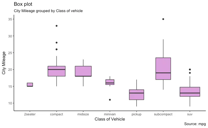
library(ggthemes)
g <- ggplot(mpg, aes(class, cty))
g + geom_boxplot(aes(fill=factor(cyl))) +
theme(axis.text.x = element_text(angle=65, vjust=0.6)) +
labs(title="Box plot",
subtitle="City Mileage grouped by Class of vehicle",
caption="Source: mpg",
x="Class of Vehicle",
y="City Mileage")
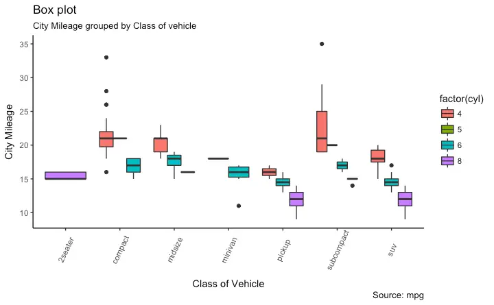
Dot + Box Plot
On top of the information provided by a box plot, the dot plot can provide more clear information in the form of summary statistics by each group. The dots are staggered such that each dot represents one observation. So, in below chart, the number of dots for a given manufacturer will match the number of rows of that manufacturer in source data.library(ggplot2)
theme_set(theme_bw())
# plot
g <- ggplot(mpg, aes(manufacturer, cty))
g + geom_boxplot() +
geom_dotplot(binaxis='y',
stackdir='center',
dotsize = .5,
fill="red") +
theme(axis.text.x = element_text(angle=65, vjust=0.6)) +
labs(title="Box plot + Dot plot",
subtitle="City Mileage vs Class: Each dot represents 1 row in source data",
caption="Source: mpg",
x="Class of Vehicle",
y="City Mileage")
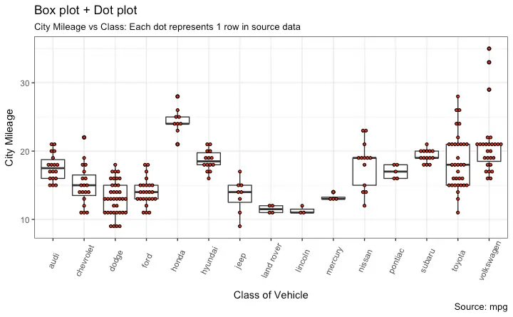
Tufte Boxplot
Tufte box plot, provided byggthemes package is inspired by the works of Edward Tufte.
Tufte’s Box plot is just a box plot made minimal and visually appealing.
library(ggthemes)
library(ggplot2)
theme_set(theme_tufte()) # from ggthemes
# plot
g <- ggplot(mpg, aes(manufacturer, cty))
g + geom_tufteboxplot() +
theme(axis.text.x = element_text(angle=65, vjust=0.6)) +
labs(title="Tufte Styled Boxplot",
subtitle="City Mileage grouped by Class of vehicle",
caption="Source: mpg",
x="Class of Vehicle",
y="City Mileage")
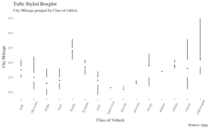
Violin Plot
A violin plot is similar to box plot but shows the density within groups. Not much info provided as in boxplots. It can be drawn usinggeom_violin().
library(ggplot2)
theme_set(theme_bw())
# plot
g <- ggplot(mpg, aes(class, cty))
g + geom_violin() +
labs(title="Violin plot",
subtitle="City Mileage vs Class of vehicle",
caption="Source: mpg",
x="Class of Vehicle",
y="City Mileage")
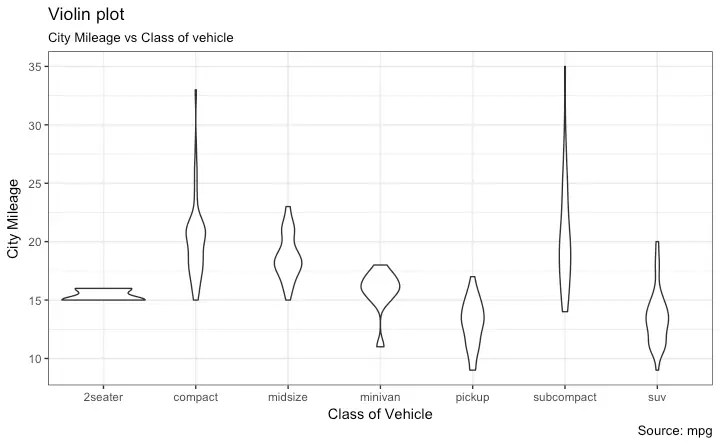
Population Pyramid
Population pyramids offer a unique way of visualizing how much population or what percentage of population fall under a certain category. The below pyramid is an excellent example of how many users are retained at each stage of a email marketing campaign funnel.library(ggplot2)
library(ggthemes)
options(scipen = 999) # turns of scientific notations like 1e+40
# Read data
email_campaign_funnel <- read.csv("https://raw.githubusercontent.com/selva86/datasets/master/email_campaign_funnel.csv")
# X Axis Breaks and Labels
brks <- seq(-15000000, 15000000, 5000000)
lbls = paste0(as.character(c(seq(15, 0, -5), seq(5, 15, 5))), "m")
# Plot
ggplot(email_campaign_funnel, aes(x = Stage, y = Users, fill = Gender)) + # Fill column
geom_bar(stat = "identity", width = .6) + # draw the bars
scale_y_continuous(breaks = brks, # Breaks
labels = lbls) + # Labels
coord_flip() + # Flip axes
labs(title="Email Campaign Funnel") +
theme_tufte() + # Tufte theme from ggfortify
theme(plot.title = element_text(hjust = .5),
axis.ticks = element_blank()) + # Centre plot title
scale_fill_brewer(palette = "Dark2") # Color palette
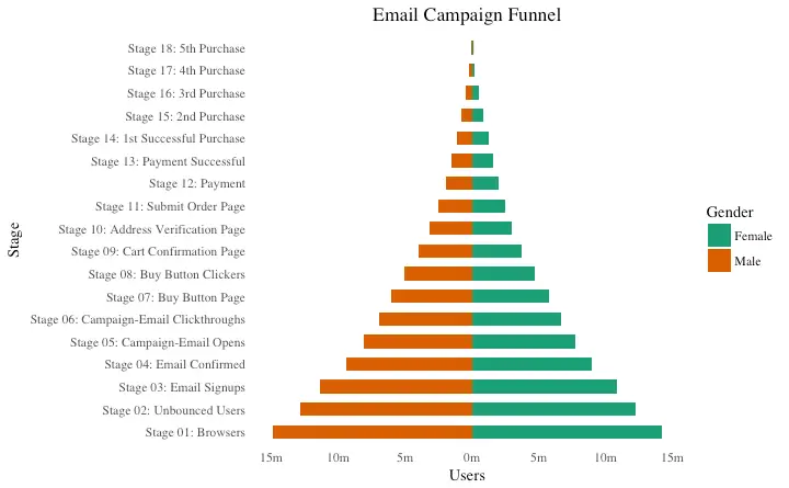
5. Composition
Waffle Chart
Waffle charts is a nice way of showing the categorical composition of the total population. Though there is no direct function, it can be articulated by smartly maneuvering the ggplot2 usinggeom_tile() function.
The below template should help you create your own waffle.
var <- mpg$class # the categorical data
## Prep data (nothing to change here)
nrows <- 10
df <- expand.grid(y = 1:nrows, x = 1:nrows)
categ_table <- round(table(var) * ((nrows*nrows)/(length(var))))
categ_table
#> 2seater compact midsize minivan pickup subcompact suv
#> 2 20 18 5 14 15 26
df$category <- factor(rep(names(categ_table), categ_table))
# NOTE: if sum(categ_table) is not 100 (i.e.
nrows^2), it will need adjustment to make the sum to 100.
## Plot
ggplot(df, aes(x = x, y = y, fill = category)) +
geom_tile(color = "black", size = 0.5) +
scale_x_continuous(expand = c(0, 0)) +
scale_y_continuous(expand = c(0, 0), trans = 'reverse') +
scale_fill_brewer(palette = "Set3") +
labs(title="Waffle Chart", subtitle="'Class' of vehicles",
caption="Source: mpg") +
theme(panel.border = element_rect(size = 2),
plot.title = element_text(size = rel(1.2)),
axis.text = element_blank(),
axis.title = element_blank(),
axis.ticks = element_blank(),
legend.title = element_blank(),
legend.position = "right")
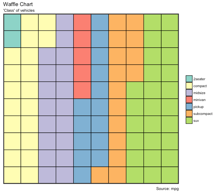
Pie Chart
Pie chart, a classic way of showing the compositions is equivalent to the waffle chart in terms of the information conveyed. But is a slightly tricky to implement in ggplot2 using thecoord_polar().
library(ggplot2)
theme_set(theme_classic())
# Source: Frequency table
df <- as.data.frame(table(mpg$class))
colnames(df) <- c("class", "freq")
pie <- ggplot(df, aes(x = ", y=freq, fill = factor(class))) +
geom_bar(width = 1, stat = "identity") +
theme(axis.line = element_blank(),
plot.title = element_text(hjust=0.5)) +
labs(fill="class",
x=NULL,
y=NULL,
title="Pie Chart of class",
caption="Source: mpg")
pie + coord_polar(theta = "y", start=0)
# Source: Categorical variable.
# mpg$class
pie <- ggplot(mpg, aes(x = ", fill = factor(class))) +
geom_bar(width = 1) +
theme(axis.line = element_blank(),
plot.title = element_text(hjust=0.5)) +
labs(fill="class",
x=NULL,
y=NULL,
title="Pie Chart of class",
caption="Source: mpg")
pie + coord_polar(theta = "y", start=0)
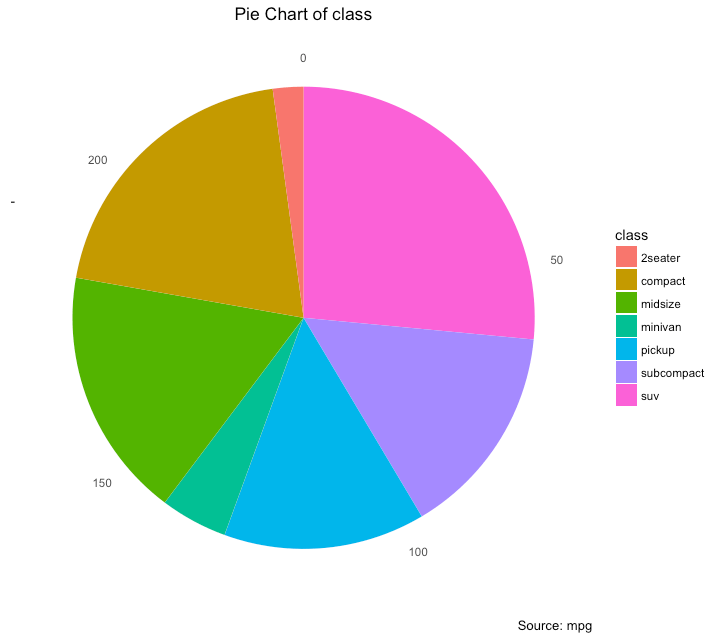
# http://www.r-graph-gallery.com/128-ring-or-donut-plot/
Treemap
Treemap is a nice way of displaying hierarchical data by using nested rectangles. Thetreemapify package provides the necessary functions to convert the data in desired format (treemapify) as well as draw the actual plot (ggplotify).
In order to create a treemap, the data must be converted to desired format using treemapify().
The important requirement is, your data must have one variable each that describes the area of the tiles, variable for fill color, variable that has the tile’s label and finally the parent group.
Once the data formatting is done, just call ggplotify() on the treemapified data.
library(ggplot2)
library(treemapify)
proglangs <- read.csv("https://raw.githubusercontent.com/selva86/datasets/master/proglanguages.csv")
# plot
treeMapCoordinates <- treemapify(proglangs,
area = "value",
fill = "parent",
label = "id",
group = "parent")
treeMapPlot <- ggplotify(treeMapCoordinates) +
scale_x_continuous(expand = c(0, 0)) +
scale_y_continuous(expand = c(0, 0)) +
scale_fill_brewer(palette = "Dark2")
print(treeMapPlot)
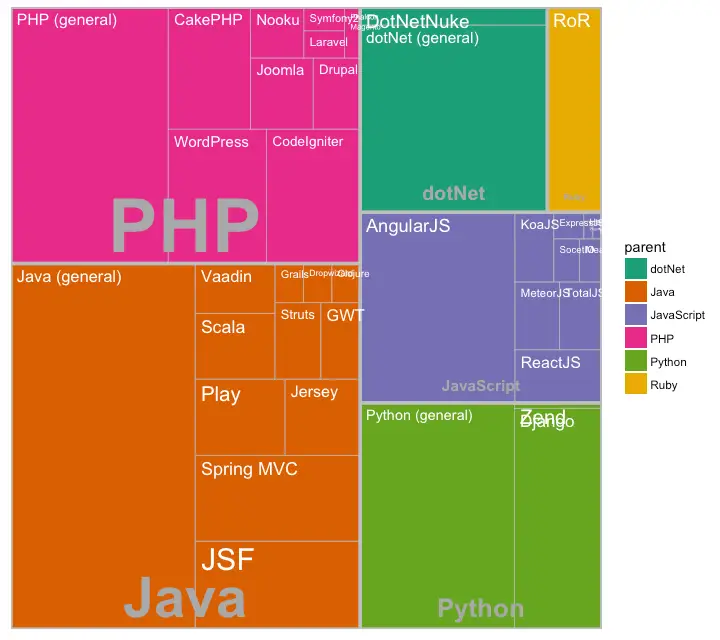
Bar Chart
By default,geom_bar() has the stat set to count.
That means, when you provide just a continuous X variable (and no Y variable), it tries to make a histogram out of the data.
In order to make a bar chart create bars instead of histogram, you need to do two things.
Set stat=identity
Provide both x and y inside aes() where, x is either character or factor and y is numeric.
A bar chart can be drawn from a categorical column variable or from a separate frequency table.
By adjusting width, you can adjust the thickness of the bars.
If your data source is a frequency table, that is, if you don’t want ggplot to compute the counts, you need to set the stat=identity inside the geom_bar().
# prep frequency table
freqtable <- table(mpg$manufacturer)
df <- as.data.frame.table(freqtable)
head(df)
#> Var1 Freq
#> 1 audi 18
#> 2 chevrolet 19
#> 3 dodge 37
#> 4 ford 25
#> 5 honda 9
#> 6 hyundai 14
# plot
library(ggplot2)
theme_set(theme_classic())
# Plot
g <- ggplot(df, aes(Var1, Freq))
g + geom_bar(stat="identity", width = 0.5, fill="tomato2") +
labs(title="Bar Chart",
subtitle="Manufacturer of vehicles",
caption="Source: Frequency of Manufacturers from 'mpg' dataset") +
theme(axis.text.x = element_text(angle=65, vjust=0.6))
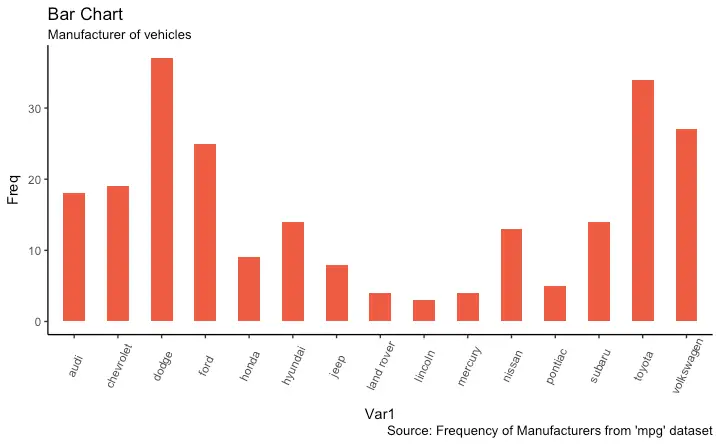 It can be computed directly from a column variable as well.
In this case, only X is provided and
 stat=identity is not set.
# From on a categorical column variable
g <- ggplot(mpg, aes(manufacturer))
g + geom_bar(aes(fill=class), width = 0.5) +
theme(axis.text.x = element_text(angle=65, vjust=0.6)) +
labs(title="Categorywise Bar Chart",
subtitle="Manufacturer of vehicles",
caption="Source: Manufacturers from 'mpg' dataset")
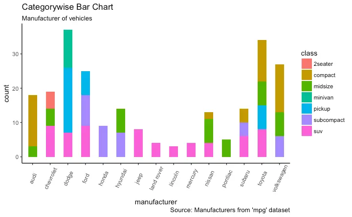
6. Change
Time Series Plot From a Time Series Object (ts)
The ggfortify package allows autoplot to automatically plot directly from a time series object (ts).
## From Timeseries object (ts)
library(ggplot2)
library(ggfortify)
theme_set(theme_classic())
# Plot
autoplot(AirPassengers) +
labs(title="AirPassengers") +
theme(plot.title = element_text(hjust=0.5))
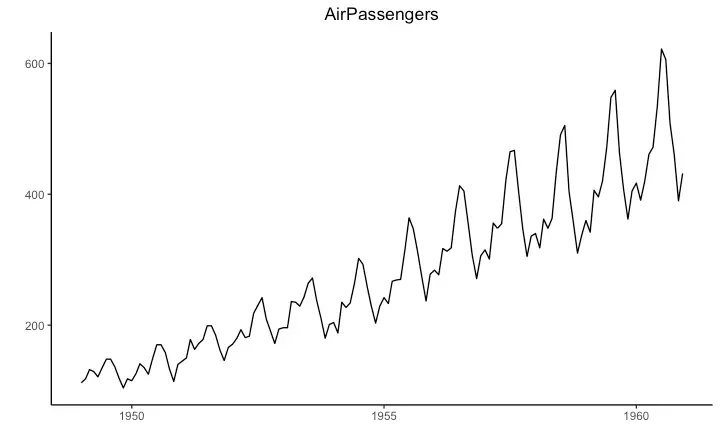
Time Series Plot From a Data Frame
Usinggeom_line(), a time series (or line chart) can be drawn from a data.frame as well.
The X axis breaks are generated by default.
In below example, the breaks are formed once every 10 years.
Default X Axis Labels
library(ggplot2)
theme_set(theme_classic())
# Allow Default X Axis Labels
ggplot(economics, aes(x=date)) +
geom_line(aes(y=returns_perc)) +
labs(title="Time Series Chart",
subtitle="Returns Percentage from 'Economics' Dataset",
caption="Source: Economics",
y="Returns %")
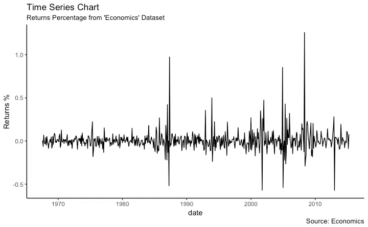
Time Series Plot For a Monthly Time Series
If you want to set your own time intervals (breaks) in X axis, you need to set the breaks and labels usingscale_x_date().
library(ggplot2)
library(lubridate)
theme_set(theme_bw())
economics_m <- economics[1:24, ]
# labels and breaks for X axis text
lbls <- paste0(month.abb[month(economics_m$date)], " ", lubridate::year(economics_m$date))
brks <- economics_m$date
# plot
ggplot(economics_m, aes(x=date)) +
geom_line(aes(y=returns_perc)) +
labs(title="Monthly Time Series",
subtitle="Returns Percentage from Economics Dataset",
caption="Source: Economics",
y="Returns %") + # title and caption
scale_x_date(labels = lbls,
breaks = brks) + # change to monthly ticks and labels
theme(axis.text.x = element_text(angle = 90, vjust=0.5), # rotate x axis text
panel.grid.minor = element_blank()) # turn off minor grid
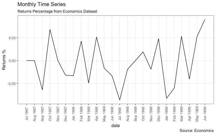
Time Series Plot For a Yearly Time Series
library(ggplot2)
library(lubridate)
theme_set(theme_bw())
economics_y <- economics[1:90, ]
# labels and breaks for X axis text
brks <- economics_y$date[seq(1, length(economics_y$date), 12)]
lbls <- lubridate::year(brks)
# plot
ggplot(economics_y, aes(x=date)) +
geom_line(aes(y=returns_perc)) +
labs(title="Yearly Time Series",
subtitle="Returns Percentage from Economics Dataset",
caption="Source: Economics",
y="Returns %") + # title and caption
scale_x_date(labels = lbls,
breaks = brks) + # change to monthly ticks and labels
theme(axis.text.x = element_text(angle = 90, vjust=0.5), # rotate x axis text
panel.grid.minor = element_blank()) # turn off minor grid
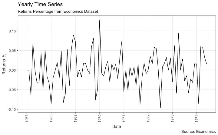
Time Series Plot From Long Data Format: Multiple Time Series in Same Dataframe Column
In this example, I construct the ggplot from a long data format. That means, the column names and respective values of all the columns are stacked in just 2 variables (variable and value respectively).
If you were to convert this data to wide format, it would look like the economics dataset.
In below example, the geom_line is drawn for value column and the aes(col) is set to variable.
This way, with just one call to geom_line, multiple colored lines are drawn, one each for each unique value in variable column.
The scale_x_date() changes the X axis breaks and labels, and scale_color_manual changes the color of the lines.
data(economics_long, package = "ggplot2")
head(economics_long)
#> date variable value value01
#> <date> <fctr> <dbl> <dbl>
#> 1 1967-07-01 pce 507.4 0.0000000000
#> 2 1967-08-01 pce 510.5 0.0002660008
#> 3 1967-09-01 pce 516.3 0.0007636797
#> 4 1967-10-01 pce 512.9 0.0004719369
#> 5 1967-11-01 pce 518.1 0.0009181318
#> 6 1967-12-01 pce 525.8 0.0015788435
library(ggplot2)
library(lubridate)
theme_set(theme_bw())
df <- economics_long[economics_long$variable %in% c("psavert", "uempmed"), ]
df <- df[lubridate::year(df$date) %in% c(1967:1981), ]
# labels and breaks for X axis text
brks <- df$date[seq(1, length(df$date), 12)]
lbls <- lubridate::year(brks)
# plot
ggplot(df, aes(x=date)) +
geom_line(aes(y=value, col=variable)) +
labs(title="Time Series of Returns Percentage",
subtitle="Drawn from Long Data format",
caption="Source: Economics",
y="Returns %",
color=NULL) + # title and caption
scale_x_date(labels = lbls, breaks = brks) + # change to monthly ticks and labels
scale_color_manual(labels = c("psavert", "uempmed"),
values = c("psavert"="#00ba38", "uempmed"="#f8766d")) + # line color
theme(axis.text.x = element_text(angle = 90, vjust=0.5, size = 8), # rotate x axis text
panel.grid.minor = element_blank()) # turn off minor grid
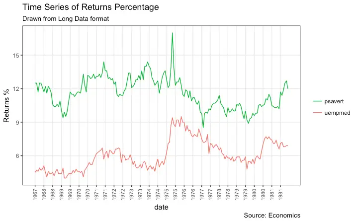
Time Series Plot From Wide Data Format: Data in Multiple Columns of Dataframe
But if you are creating a time series (or even other types of plots) from a wide data format, you have to draw each line manually by callinggeom_line() once for every line.
So, a legend will not be drawn by default.
However, having a legend would still be nice.
This can be done using the scale_aesthetic_manual() format of functions (like, scale_color_manual() if only the color of your lines change).
Using this function, you can give a legend title with the name argument, tell what color the legend should take with the values argument and also set the legend labels.
Even though the below plot looks exactly like the previous one, the approach to construct this is different.
You might wonder why I used this function in previous example for long data format as well.
Note that, in previous example, it was used to change the color of the line only.
Without scale_color_manual(), you would still have got a legend, but the lines would be of a different (default) color.
But in current example, without scale_color_manual(), you wouldn’t even have a legend.
Try it out!
library(ggplot2)
library(lubridate)
theme_set(theme_bw())
df <- economics[, c("date", "psavert", "uempmed")]
df <- df[lubridate::year(df$date) %in% c(1967:1981), ]
# labels and breaks for X axis text
brks <- df$date[seq(1, length(df$date), 12)]
lbls <- lubridate::year(brks)
# plot
ggplot(df, aes(x=date)) +
geom_line(aes(y=psavert, col="psavert")) +
geom_line(aes(y=uempmed, col="uempmed")) +
labs(title="Time Series of Returns Percentage",
subtitle="Drawn From Wide Data format",
caption="Source: Economics", y="Returns %") + # title and caption
scale_x_date(labels = lbls, breaks = brks) + # change to monthly ticks and labels
scale_color_manual(name=",
values = c("psavert"="#00ba38", "uempmed"="#f8766d")) + # line color
theme(panel.grid.minor = element_blank()) # turn off minor grid
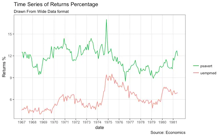
Stacked Area Chart
Stacked area chart is just like a line chart, except that the region below the plot is all colored. This is typically used when: You want to describe how a quantity or volume (rather than something like price) changed over time You have many data points. For very few data points, consider plotting a bar chart. You want to show the contribution from individual components. This can be plotted usinggeom_area which works very much like geom_line.
But there is an important point to note.
By default, each geom_area() starts from the bottom of Y axis (which is typically 0), but, if you want to show the contribution from individual components, you want the geom_area to be stacked over the top of previous component, rather than the floor of the plot itself.
So, you have to add all the bottom layers while setting the y of geom_area.
In below example, I have set it as y=psavert+uempmed for the topmost geom_area().
However nice the plot looks, the caveat is that, it can easily become complicated and uninterprettable if there are too many components.
library(ggplot2)
library(lubridate)
theme_set(theme_bw())
df <- economics[, c("date", "psavert", "uempmed")]
df <- df[lubridate::year(df$date) %in% c(1967:1981), ]
# labels and breaks for X axis text
brks <- df$date[seq(1, length(df$date), 12)]
lbls <- lubridate::year(brks)
# plot
ggplot(df, aes(x=date)) +
geom_area(aes(y=psavert+uempmed, fill="psavert")) +
geom_area(aes(y=uempmed, fill="uempmed")) +
labs(title="Area Chart of Returns Percentage",
subtitle="From Wide Data format",
caption="Source: Economics",
y="Returns %") + # title and caption
scale_x_date(labels = lbls, breaks = brks) + # change to monthly ticks and labels
scale_fill_manual(name=",
values = c("psavert"="#00ba38", "uempmed"="#f8766d")) + # line color
theme(panel.grid.minor = element_blank()) # turn off minor grid
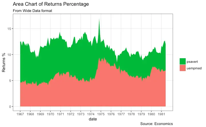
Calendar Heatmap
When you want to see the variation, especially the highs and lows, of a metric like stock price, on an actual calendar itself, the calendar heat map is a great tool. It emphasizes the variation visually over time rather than the actual value itself. This can be implemented using thegeom_tile.
But getting it in the right format has more to do with the data preparation rather than the plotting itself.
# http://margintale.blogspot.in/2012/04/ggplot2-time-series-heatmaps.html
library(ggplot2)
library(plyr)
library(scales)
library(zoo)
df <- read.csv("https://raw.githubusercontent.com/selva86/datasets/master/yahoo.csv")
df$date <- as.Date(df$date) # format date
df <- df[df$year >= 2012, ] # filter reqd years
# Create Month Week
df$yearmonth <- as.yearmon(df$date)
df$yearmonthf <- factor(df$yearmonth)
df <- ddply(df,.(yearmonthf), transform, monthweek=1+week-min(week)) # compute week number of month
df <- df[, c("year", "yearmonthf", "monthf", "week", "monthweek", "weekdayf", "VIX.Close")]
head(df)
#> year yearmonthf monthf week monthweek weekdayf VIX.Close
#> 1 2012 Jan 2012 Jan 1 1 Tue 22.97
#> 2 2012 Jan 2012 Jan 1 1 Wed 22.22
#> 3 2012 Jan 2012 Jan 1 1 Thu 21.48
#> 4 2012 Jan 2012 Jan 1 1 Fri 20.63
#> 5 2012 Jan 2012 Jan 2 2 Mon 21.07
#> 6 2012 Jan 2012 Jan 2 2 Tue 20.69
# Plot
ggplot(df, aes(monthweek, weekdayf, fill = VIX.Close)) +
geom_tile(colour = "white") +
facet_grid(year~monthf) +
scale_fill_gradient(low="red", high="green") +
labs(x="Week of Month",
y=",
title = "Time-Series Calendar Heatmap",
subtitle="Yahoo Closing Price",
fill="Close")
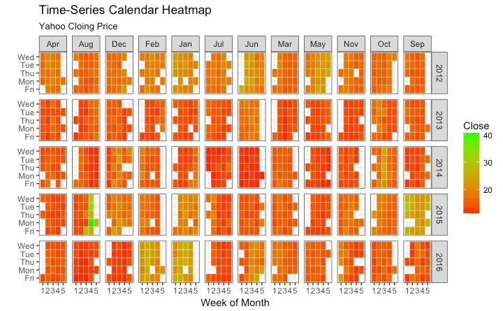
Slope Chart
Slope chart is a great tool of you want to visualize change in value and ranking between categories. This is more suitable over a time series when there are very few time points.library(dplyr)
theme_set(theme_classic())
source_df <- read.csv("https://raw.githubusercontent.com/jkeirstead/r-slopegraph/master/cancer_survival_rates.csv")
# Define functions.
Source: https://github.com/jkeirstead/r-slopegraph
tufte_sort <- function(df, x="year", y="value", group="group", method="tufte", min.space=0.05) {
## First rename the columns for consistency
ids <- match(c(x, y, group), names(df))
df <- df[,ids]
names(df) <- c("x", "y", "group")
## Expand grid to ensure every combination has a defined value
tmp <- expand.grid(x=unique(df$x), group=unique(df$group))
tmp <- merge(df, tmp, all.y=TRUE)
df <- mutate(tmp, y=ifelse(is.na(y), 0, y))
## Cast into a matrix shape and arrange by first column
require(reshape2)
tmp <- dcast(df, group ~ x, value.var="y")
ord <- order(tmp[,2])
tmp <- tmp[ord,]
min.space <- min.space*diff(range(tmp[,-1]))
yshift <- numeric(nrow(tmp))
## Start at "bottom" row
## Repeat for rest of the rows until you hit the top
for (i in 2:nrow(tmp)) {
## Shift subsequent row up by equal space so gap between
## two entries is >= minimum
mat <- as.matrix(tmp[(i-1):i, -1])
d.min <- min(diff(mat))
yshift[i] <- ifelse(d.min < min.space, min.space - d.min, 0)
}
tmp <- cbind(tmp, yshift=cumsum(yshift))
scale <- 1
tmp <- melt(tmp, id=c("group", "yshift"), variable.name="x", value.name="y")
## Store these gaps in a separate variable so that they can be scaled ypos = a*yshift + y
tmp <- transform(tmp, ypos=y + scale*yshift)
return(tmp)
}
plot_slopegraph <- function(df) {
ylabs <- subset(df, x==head(x,1))$group
yvals <- subset(df, x==head(x,1))$ypos
fontSize <- 3
gg <- ggplot(df,aes(x=x,y=ypos)) +
geom_line(aes(group=group),colour="grey80") +
geom_point(colour="white",size=8) +
geom_text(aes(label=y), size=fontSize, family="American Typewriter") +
scale_y_continuous(name=", breaks=yvals, labels=ylabs)
return(gg)
}
## Prepare data
df <- tufte_sort(source_df,
x="year",
y="value",
group="group",
method="tufte",
min.space=0.05)
df <- transform(df,
x=factor(x, levels=c(5,10,15,20),
labels=c("5 years","10 years","15 years","20 years")),
y=round(y))
## Plot
plot_slopegraph(df) + labs(title="Estimates of % survival rates") +
theme(axis.title=element_blank(),
axis.ticks = element_blank(),
plot.title = element_text(hjust=0.5,
family = "American Typewriter",
face="bold"),
axis.text = element_text(family = "American Typewriter",
face="bold"))
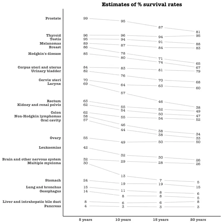
Seasonal Plot
If you are working with a time series object of classts or xts, you can view the seasonal fluctuations through a seasonal plot drawn using forecast::ggseasonplot.
Below is an example using the native AirPassengers and nottem time series.
You can see the traffic increase in air passengers over the years along with the repetitive seasonal patterns in traffic.
Whereas Nottingham does not show an increase in overal temperatures over the years, but they definitely follow a seasonal pattern.
library(ggplot2)
library(forecast)
theme_set(theme_classic())
# Subset data
nottem_small <- window(nottem, start=c(1920, 1), end=c(1925, 12)) # subset a smaller timewindow
# Plot
ggseasonplot(AirPassengers) + labs(title="Seasonal plot: International Airline Passengers")
ggseasonplot(nottem_small) + labs(title="Seasonal plot: Air temperatures at Nottingham Castle")
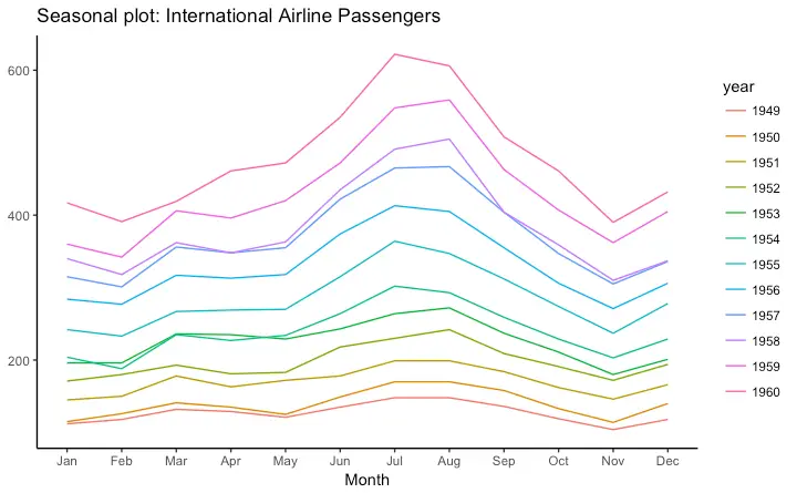
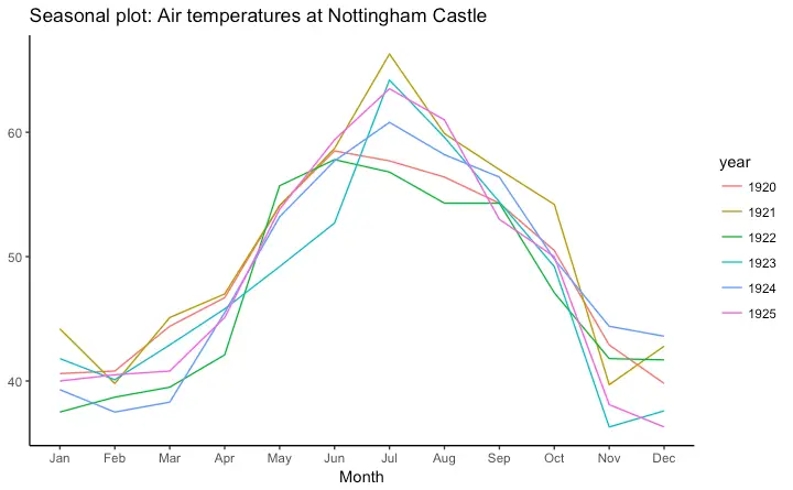
7. Groups
Hierarchical Dendrogram
# install.packages("ggdendro")
library(ggplot2)
library(ggdendro)
theme_set(theme_bw())
hc <- hclust(dist(USArrests), "ave") # hierarchical clustering
# plot
ggdendrogram(hc, rotate = TRUE, size = 2)
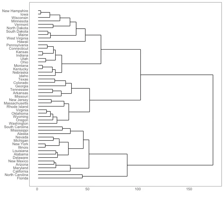
Clusters
It is possible to show the distinct clusters or groups usinggeom_encircle().
If the dataset has multiple weak features, you can compute the principal components and draw a scatterplot using PC1 and PC2 as X and Y axis.
The geom_encircle() can be used to encircle the desired groups.
The only thing to note is the data argument to geom_circle().
You need to provide a subsetted dataframe that contains only the observations (rows) that belong to the group as the data argument.
# devtools::install_github("hrbrmstr/ggalt")
library(ggplot2)
library(ggalt)
library(ggfortify)
theme_set(theme_classic())
# Compute data with principal components ------------------
df <- iris[c(1, 2, 3, 4)]
pca_mod <- prcomp(df) # compute principal components
# Data frame of principal components ----------------------
df_pc <- data.frame(pca_mod$x, Species=iris$Species) # dataframe of principal components
df_pc_vir <- df_pc[df_pc$Species == "virginica", ] # df for 'virginica'
df_pc_set <- df_pc[df_pc$Species == "setosa", ] # df for 'setosa'
df_pc_ver <- df_pc[df_pc$Species == "versicolor", ] # df for 'versicolor'
# Plot ----------------------------------------------------
ggplot(df_pc, aes(PC1, PC2, col=Species)) +
geom_point(aes(shape=Species), size=2) + # draw points
labs(title="Iris Clustering",
subtitle="With principal components PC1 and PC2 as X and Y axis",
caption="Source: Iris") +
coord_cartesian(xlim = 1.2 * c(min(df_pc$PC1), max(df_pc$PC1)),
ylim = 1.2 * c(min(df_pc$PC2), max(df_pc$PC2))) + # change axis limits
geom_encircle(data = df_pc_vir, aes(x=PC1, y=PC2)) + # draw circles
geom_encircle(data = df_pc_set, aes(x=PC1, y=PC2)) +
geom_encircle(data = df_pc_ver, aes(x=PC1, y=PC2))
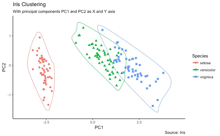
8. Spatial
Theggmap package provides facilities to interact with the google maps api and get the coordinates (latitude and longitude) of places you want to plot.
The below example shows satellite, road and hybrid maps of the city of Chennai, encircling some of the places.
I used the geocode() function to get the coordinates of these places and qmap() to get the maps.
The type of map to fetch is determined by the value you set to the maptype.
You can also zoom into the map by setting the zoom argument.
The default is 10 (suitable for large cities).
Reduce this number (up to 3) if you want to zoom out.
It can be zoomed in till 21, suitable for buildings.
# Better install the dev versions ----------
# devtools::install_github("dkahle/ggmap")
# devtools::install_github("hrbrmstr/ggalt")
# load packages
library(ggplot2)
library(ggmap)
library(ggalt)
# Get Chennai's Coordinates --------------------------------
chennai <- geocode("Chennai") # get longitude and latitude
# Get the Map ----------------------------------------------
# Google Satellite Map
chennai_ggl_sat_map <- qmap("chennai", zoom=12, source = "google", maptype="satellite")
# Google Road Map
chennai_ggl_road_map <- qmap("chennai", zoom=12, source = "google", maptype="roadmap")
# Google Hybrid Map
chennai_ggl_hybrid_map <- qmap("chennai", zoom=12, source = "google", maptype="hybrid")
# Open Street Map
chennai_osm_map <- qmap("chennai", zoom=12, source = "osm")
# Get Coordinates for Chennai's Places ---------------------
chennai_places <- c("Kolathur",
"Washermanpet",
"Royapettah",
"Adyar",
"Guindy")
places_loc <- geocode(chennai_places) # get longitudes and latitudes
# Plot Open Street Map -------------------------------------
chennai_osm_map + geom_point(aes(x=lon, y=lat),
data = places_loc,
alpha = 0.7,
size = 7,
color = "tomato") +
geom_encircle(aes(x=lon, y=lat),
data = places_loc, size = 2, color = "blue")
# Plot Google Road Map -------------------------------------
chennai_ggl_road_map + geom_point(aes(x=lon, y=lat),
data = places_loc,
alpha = 0.7,
size = 7,
color = "tomato") +
geom_encircle(aes(x=lon, y=lat),
data = places_loc, size = 2, color = "blue")
# Google Hybrid Map ----------------------------------------
chennai_ggl_hybrid_map + geom_point(aes(x=lon, y=lat),
data = places_loc,
alpha = 0.7,
size = 7,
color = "tomato") +
geom_encircle(aes(x=lon, y=lat),
data = places_loc, size = 2, color = "blue")
Open Street Map
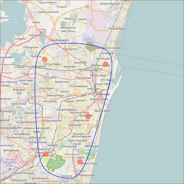
Google Road Map
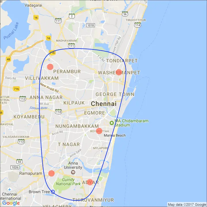
Google Hybrid Map
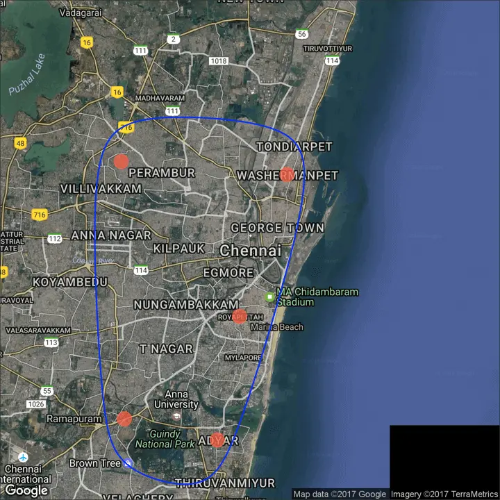 http://r-statistics.co/Complete-Ggplot2-Tutorial-Part2-Customizing-Theme-With-R-Code.html